
VIP Membership Card (Matte Black & Gold Foil)
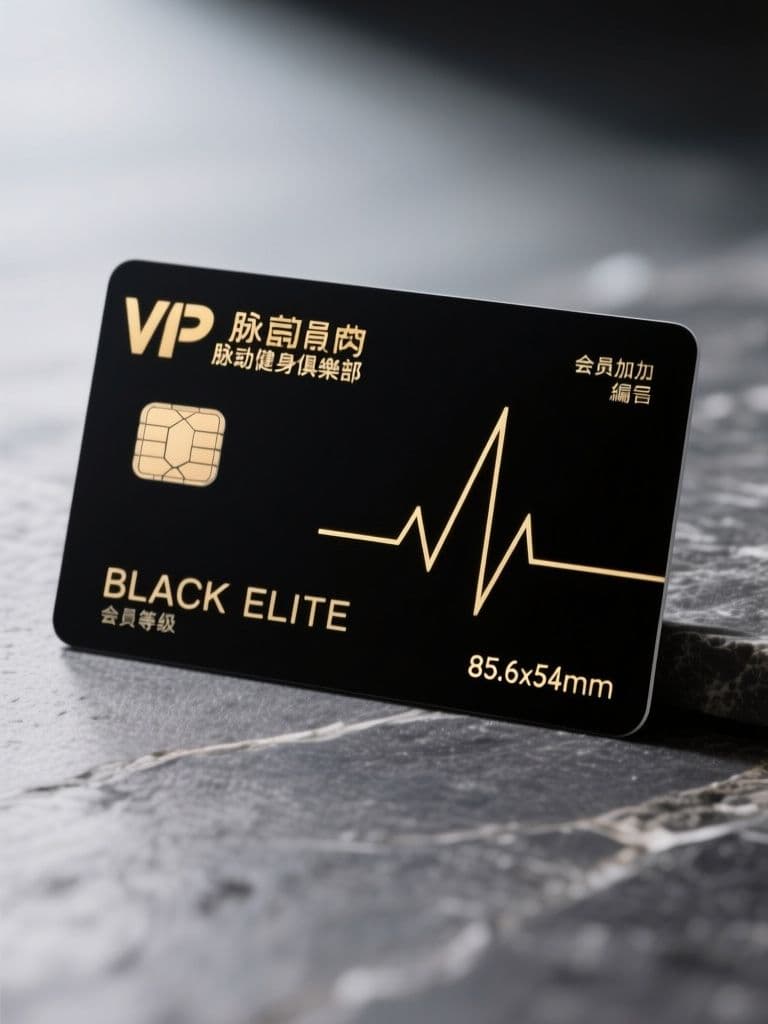
Members judge your tier program by how the card feels: the angled render with foil and emboss sells perceived value at a glance, and the quiet right half is print-ready for name personalization.
prompt
Render a premium VIP membership card design for {business_name}, a {business_type}. Standard credit-card ratio (85.6x54mm), shown at a slight three-quarter angle with soft studio lighting on a dark stone surface. Matte black card body, gold foil logo monogram in the upper left, the tier name {member_tier} embossed in small caps along the bottom edge, and a thin gold geometric line pattern inspired by {motif} running across one corner. Leave the right half visually quiet for a member name and number to be added later. Luxurious, restrained, no clutter — the kind of card members want to show off.
Variables
This prompt uses the variables below. Fill them in when you hit Copy — anything left blank keeps its {placeholder}.
- {business_name}Business name
- e.g. 脈動健身俱樂部
- {business_type}Business type
- e.g. 精品健身房
- {member_tier}Membership tier name
- e.g. BLACK ELITE
- {motif}Geometric motif inspiration
- e.g. 心跳脈搏線
Use case
Gyms, beauty salons and private studios launching a paid membership tier that needs a card worth the fee.
How to use it
Fill four variables and run it: {business_name} is your brand, {business_type} is the category (e.g. 'boutique gym' or 'private beauty salon'), {member_tier} is a short tier name (e.g. BLACK ELITE), and {motif} is the inspiration for the gold line work (a heartbeat pulse line, a coffee-bean outline, etc.). midjourney gives the richest matte-black-and-gold finish; reach for gpt-image when you want tighter layout control. Both tend to misspell the embossed tier lettering, which is exactly why the prompt keeps the right half empty — afterwards, drop the real member name and number in with Canva, double-check that {member_tier} came out spelled right, and hand it to a print shop only once it does.
Why it works
The trick is treating the card as a product photograph, not a flat design file. Locking in the 85.6x54mm credit-card ratio, the three-quarter angle, the dark stone surface and soft studio lighting forces the model to fake real product-shot depth — gold foil and embossing only read as expensive when raked light catches them, whereas a flat head-on shot looks cheap. It also assigns the layout precisely: the monogram pinned to the upper left, the {motif} gold line confined to a single corner, the right half left empty. That large quiet space is the grammar of luxury — pricier means fewer elements. The closing words restrained and no clutter actively suppress the model's habit of cramming in ornament, so the result looks like a card a member would actually pull out to show off.
Tips & variations
- {motif} is your differentiator: a gym uses a 'heartbeat pulse line', a wine club uses 'climbing grapevines', a bookstore uses 'gold book-spine ridges' — let that single gold line announce the industry.
- For a heavier metal feel, end the midjourney prompt with --ar 3:2 to lock close to the card ratio, and shift the {motif} finish to 'brushed metal' or 'rose gold foil'.
- Keep {member_tier} to two short words or fewer (BLACK ELITE, FOUNDER): the less text there is, the less the model fumbles the embossing and the more premium it reads.
- To build a full tier set, rerun with {member_tier} cycled through your silver/gold/black names while leaving the other variables fixed, and you get a visually consistent ladder of membership cards.
Recommended tools
Contains affiliate links: we may earn a commission when you purchase or sign up through them, at no extra cost to you.
Related prompts
 Cards
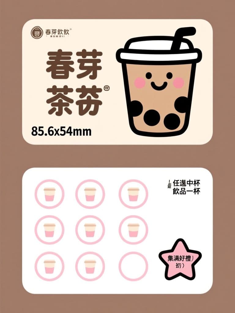
CardsBubble Tea Loyalty Stamp Card (Cute Flat Illustration)
The mascot-plus-grid layout keeps stamp slots instantly scannable, while the sticker aesthetic makes the card too cute to toss. One image renders both sides, ready to brief your printer.
 Cards
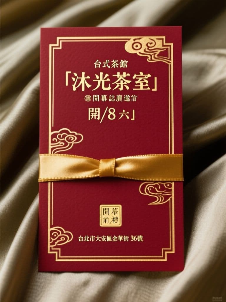
CardsGrand Opening Invitation Card (Modern Oriental Red & Gold)
Red and gold reads festive without feeling dated — the modern oriental treatment keeps it premium, and the clean lower third makes the date and address instantly legible.
 Cards
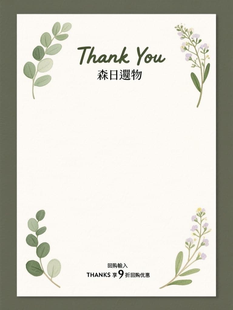
CardsPackage Insert Thank-You Card (Watercolor Botanical)
The deliberately empty middle band invites a handwritten line — the cheapest repeat-purchase trick in e-commerce — while the offer strip at the bottom quietly nudges the next order.
 Cards
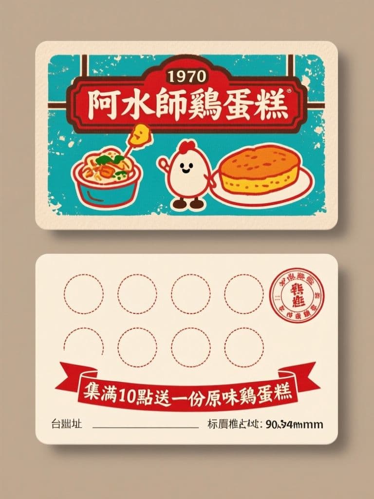
CardsNight Market Stall Stamp Card (Retro Taiwan Vintage)
The retro two-ink letterpress look makes a cheap punch card feel collectible, and the dashed stamp grid plus ribbon reward line drives repeat visits with zero design budget.
 Cards
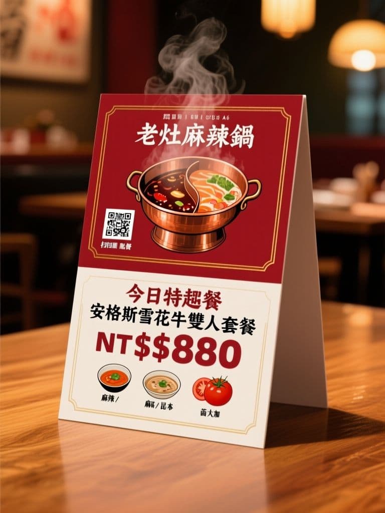
CardsHot Pot Restaurant QR Table Tent (Bold Appetite Appeal)
Puts the QR code at natural thumb height and the special's price in oversized numerals — the two layout details that actually move table-side orders.
 Cards
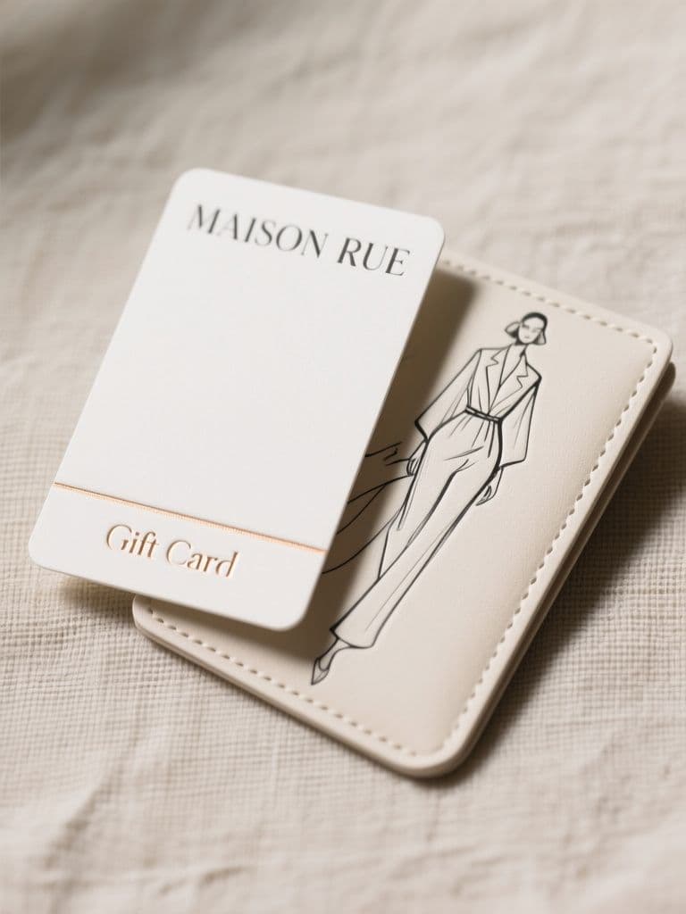
CardsFashion Boutique Gift Card (Quiet Luxury Editorial)
Blind emboss plus a single foil rule reads as premium without premium printing costs, and the sleeve turns a plain card into a giftable moment that raises average spend.