
Real Estate Open House Flyer (Twilight Architecture Shot)
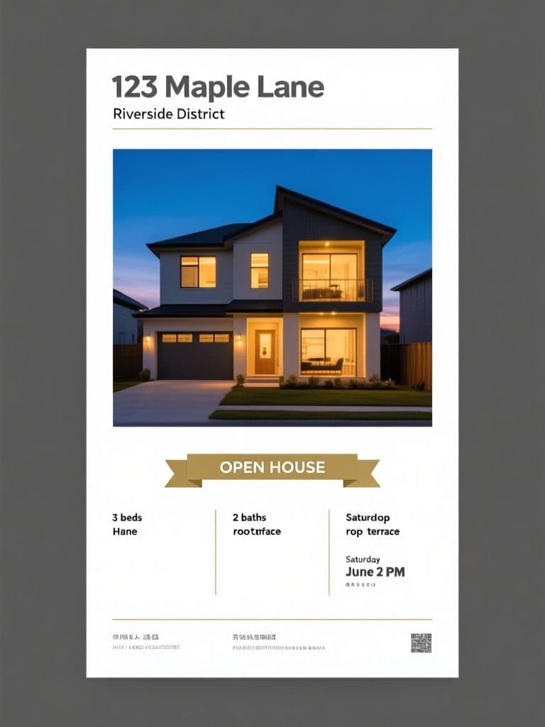
Twilight exteriors consistently outperform daytime photos in listing engagement — the warm-window-glow effect makes any property feel aspirational, while the three-column info panel keeps the flyer scannable at arm's length.
prompt
Generate a vertical 2:3 open house flyer for a real estate listing at {property_address}. Visual style: modern architectural photography — a wide-angle twilight exterior shot of a {property_type} with warm interior lights glowing against a deep blue dusk sky. Layout: full-bleed photo on the top two-thirds; bottom third is a crisp white panel headed by {property_address} as a bold single-line heading, then divided into three columns showing {key_features}, the {open_house_time}, and an agent contact placeholder. Typography: confident geometric sans-serif, charcoal text, one accent line in muted gold. Add a slim 'OPEN HOUSE' banner ribbon across the photo's lower edge. Clean, trustworthy, premium brokerage look — no watermarks, no busy graphics, print-ready sharpness.
Variables
This prompt uses the variables below. Fill them in when you hit Copy — anything left blank keeps its {placeholder}.
- {property_address}Address of the listed property
- e.g. 123 Maple Lane, Riverside District
- {property_type}Type of property shown in the hero photo
- e.g. two-story modern townhouse
- {key_features}Top selling points listed in the info panel
- e.g. 3 beds, 2 baths, rooftop terrace
- {open_house_time}Open house date and time
- e.g. Saturday June 21, 2–5 PM
Use case
A real estate agent preparing handout flyers and mailbox drops for a weekend open house event.
How to use it
Fill four variables: {property_address} is the listing address, {property_type} is the property kind (e.g. 'two-story modern townhouse'), {key_features} is your top three selling points (e.g. '3 beds, 2 baths, rooftop terrace'), and {open_house_time} is the viewing slot. The agent contact is written as a placeholder, not a variable — that empty slot is left for you on purpose. Midjourney gives the most reliable premium look; gemini-image and gpt-image work too, but all three routinely garble a real street address or a baked-in date. So the best flow is: generate the twilight exterior and white info-panel skeleton first, then layer the address, features, time, agent headshot and phone back on with a clean font in Canva — including the wording on the 'OPEN HOUSE' ribbon — so it prints crisp and survives a mailbox drop.
Why it works
The clever part is that the prompt uses layout proportion to steer the eye in order: the top two-thirds is pure emotion (a warm-lit twilight exterior) and only the bottom third is rational data — matching how a passerby gets pulled in first and reads details second. The 2:3 vertical ratio is chosen to fit a hand-out and a mailbox slot. The agent contact is a placeholder rather than a variable precisely because the model cannot be trusted to spell real text — you add the true characters afterward. The 'OPEN HOUSE' ribbon running across the photo's lower edge is a deliberate hook: from across the street it reads as an event before anyone parses the copy. And constraints like a single muted-gold accent line and 'no watermarks, no busy graphics' force the restrained negative space of a premium brokerage — since buying a home is a high-stakes decision, the cleaner the flyer reads, the more credible the agent looks.
Tips & variations
- Do not leave {property_type} bare — add a light or orientation cue like 'south-facing two-story modern townhouse' so the twilight glow lands with more drama.
- Want a daytime or sunrise variant? Swap 'twilight dusk' for 'soft morning light' and the deep blue sky for pale gold, and you can A/B test two time-of-day flyers from the same listing.
- Always give {key_features} exactly three items of similar length (roughly equal word counts), or the three columns end up with one cramped and one half-empty.
- In post, recolor the gold accent line to your brokerage brand color and drop an agent headshot into the contact slot instead of just a phone number — it usually lifts trust and call-through rates.
Recommended tools
Contains affiliate links: we may earn a commission when you purchase or sign up through them, at no extra cost to you.
Related prompts
 Flyers
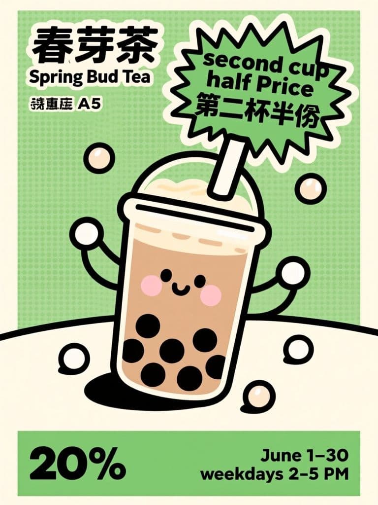
Bubble Tea 'Second Cup Half Price' Flyer (Pop Art Illustration)
A starburst badge plus one cartoon hero cup is the highest-converting layout for street handouts — passersby grasp the deal in under two seconds, and the reserved bottom band lets you drop in store info without redesigning.
 Flyers
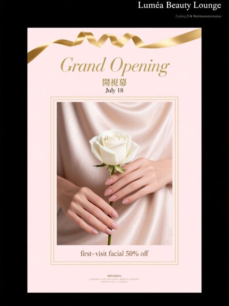
Beauty Salon Grand Opening Flyer (Soft Luxury Editorial)
Blush-and-gold with heavy negative space signals 'premium' before anyone reads a word, so your opening offer feels like an invitation rather than a discount — perfect for salons priced above market rate.
 Flyers
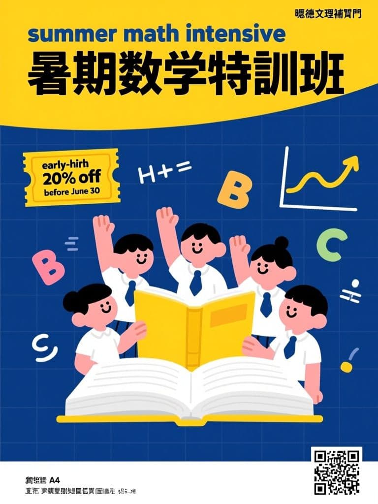
Tutoring Center Enrollment Flyer (Flat Illustration)
Navy-plus-yellow is the proven 'credible but friendly' combo for education marketing — parents read trust, kids read fun — and the ticket-stub callout makes the early-bird perk feel like a real coupon that drives enrollment calls.
 Flyers
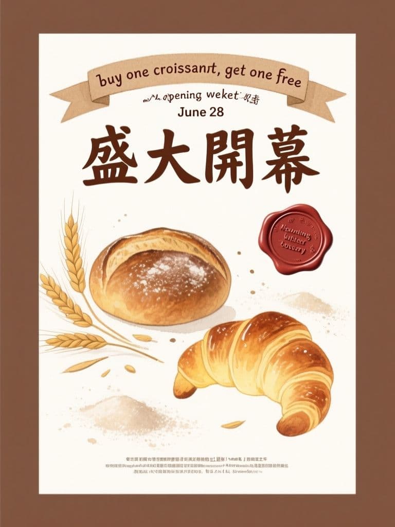
Artisan Bakery Opening Flyer (Kraft Watercolor)
Kraft texture and watercolor pastries instantly signal handmade quality, the wax-seal offer badge reads like a limited invitation, and the reserved bottom band lets you drop in contact details with zero rework.
 Flyers
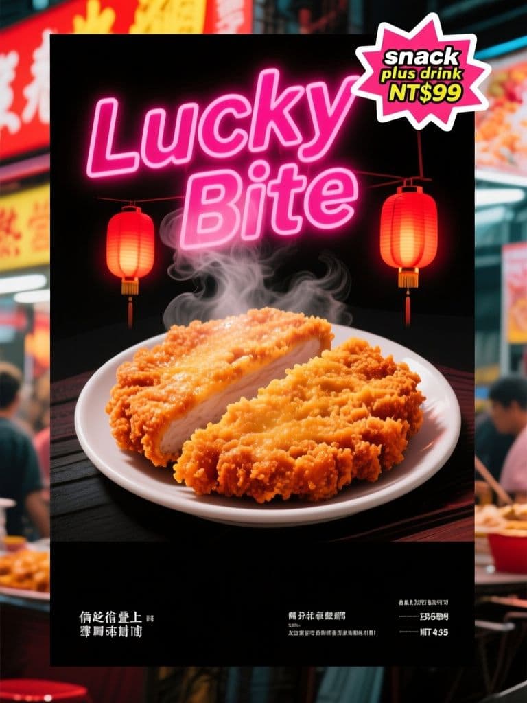
Night Market Snack Handbill (Neon Street Style)
Neon-on-dark styling makes the hero snack pop in a crowded street, the starburst sticker speaks the promo language night-market customers already trust, and the black bottom band swaps prices without redoing the art.
 Flyers
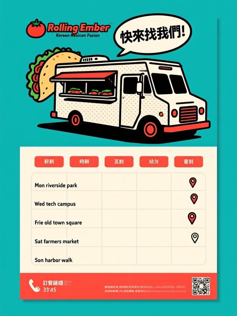
Food Truck Weekly Schedule Flyer (Retro Pop Art)
The pop-art look makes the flyer worth photographing, and the five-row timetable turns your weekly route into a saveable schedule, with a blank bottom strip so contact info can change any week.