
Tutoring Center Enrollment Poster (Bauhaus Geometric Style)
Bauhaus geometry stands out on a wall of generic tutoring flyers while still reading trustworthy to parents; the layout pre-reserves the bottom band for schedule and tuition — the first things parents look for.
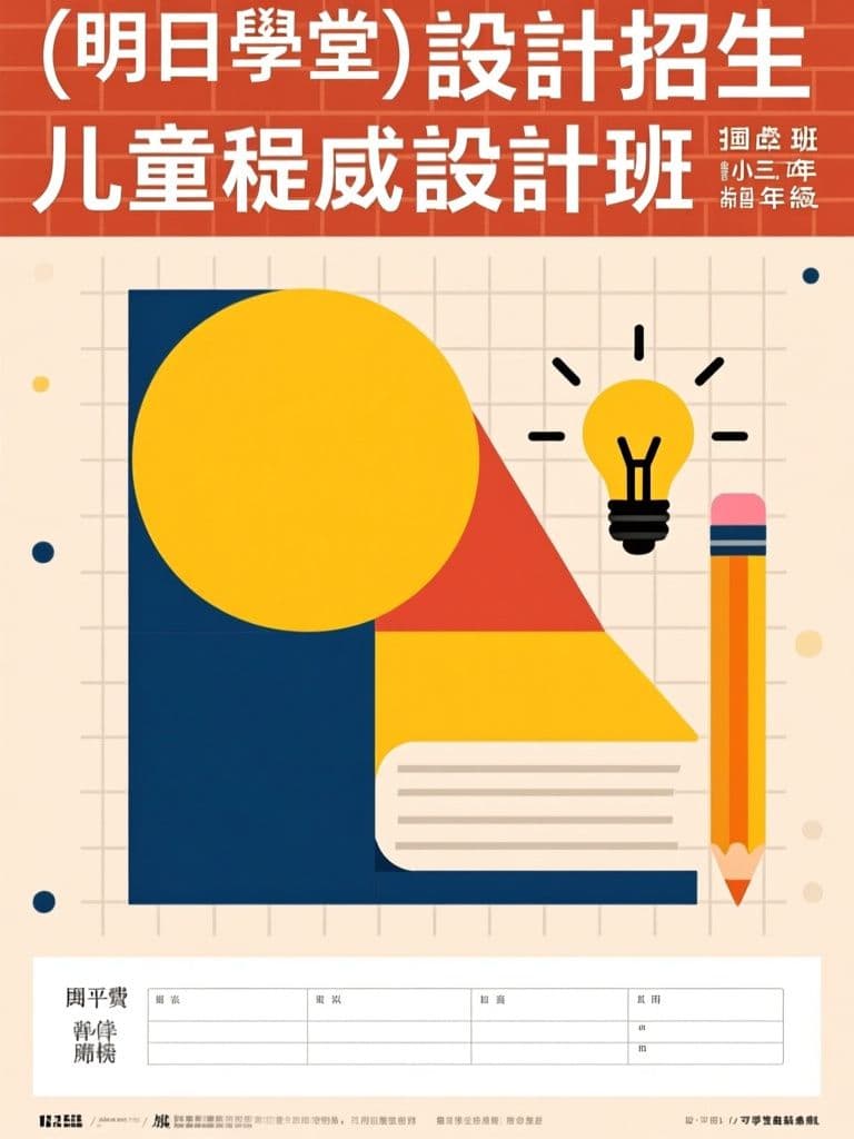
prompt
Design an enrollment poster for {course_name} at {school_name}, recruiting {target_students} for the {semester} intake. Style: Bauhaus-inspired flat geometric illustration — primary shapes (circles, triangles, arcs) forming abstract books, pencils and lightbulbs, warm cream background with mustard, brick red and deep blue accents, clean grid composition, bold geometric sans-serif placeholder text blocks. Friendly and trustworthy rather than childish. Vertical 2:3 ratio; place the headline block in the top third, illustration in the middle, and reserve a clean white band at the bottom for class schedule, tuition and contact info overlay. Flat colors only, no gradients or photorealism.
Variables
This prompt uses the variables below. Fill them in when you hit Copy — anything left blank keeps its {placeholder}.
- {course_name}Course name
- e.g. 兒童程式設計班
- {school_name}School name
- e.g. 明日學堂
- {target_students}Target students
- e.g. 國小三到六年級
- {semester}Intake term
- e.g. 暑期
Use case
Tutoring centers, studios and online course creators who need enrollment posters for the new semester intake.
Recommended tools
Contains affiliate links: we may earn a commission when you purchase or sign up through them, at no extra cost to you.
Related prompts
 Posters
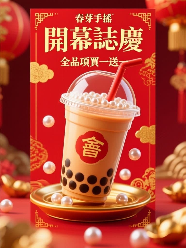
Bubble Tea Grand Opening Poster (Festive Red & Gold Pop)
Red-and-gold festivity reads as 'grand opening' at a glance, and the 3D drink hero stops foot traffic; the clean lower third lets you drop in your address and QR code without re-editing the artwork.
 Posters
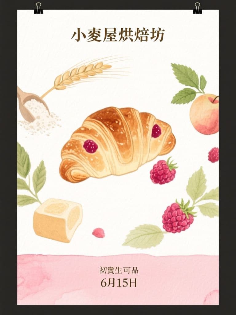
Bakery Seasonal Launch Poster (Soft Watercolor)
Watercolor illustration signals hand-made craft better than a product photo, and the orbiting-ingredients composition pulls the eye straight to the new item — artisan look without hiring an illustrator.
 Posters
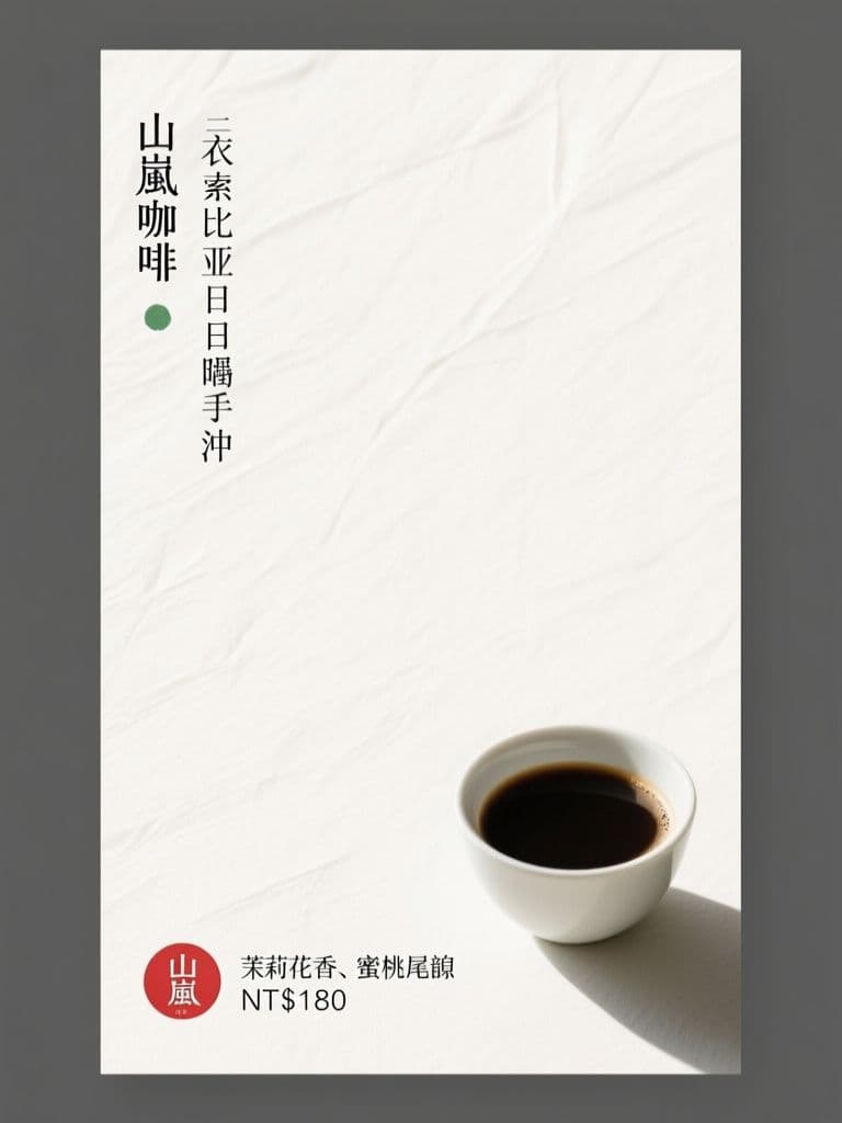
Cafe New Brew Poster (Japanese Minimalism)
Seventy percent negative space is what makes it stand out — minimalism reads as premium for specialty coffee, and the red hanko price stamp gives the eye one precise anchor point.
 Posters
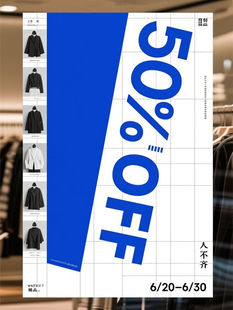
Boutique End-of-Season Sale Poster (Swiss Grid)
Turning the discount numeral itself into the rotated hero graphic is the classic Swiss conversion trick — the rational grid makes a markdown look like a designer drop, not a clearance bin.
 Posters
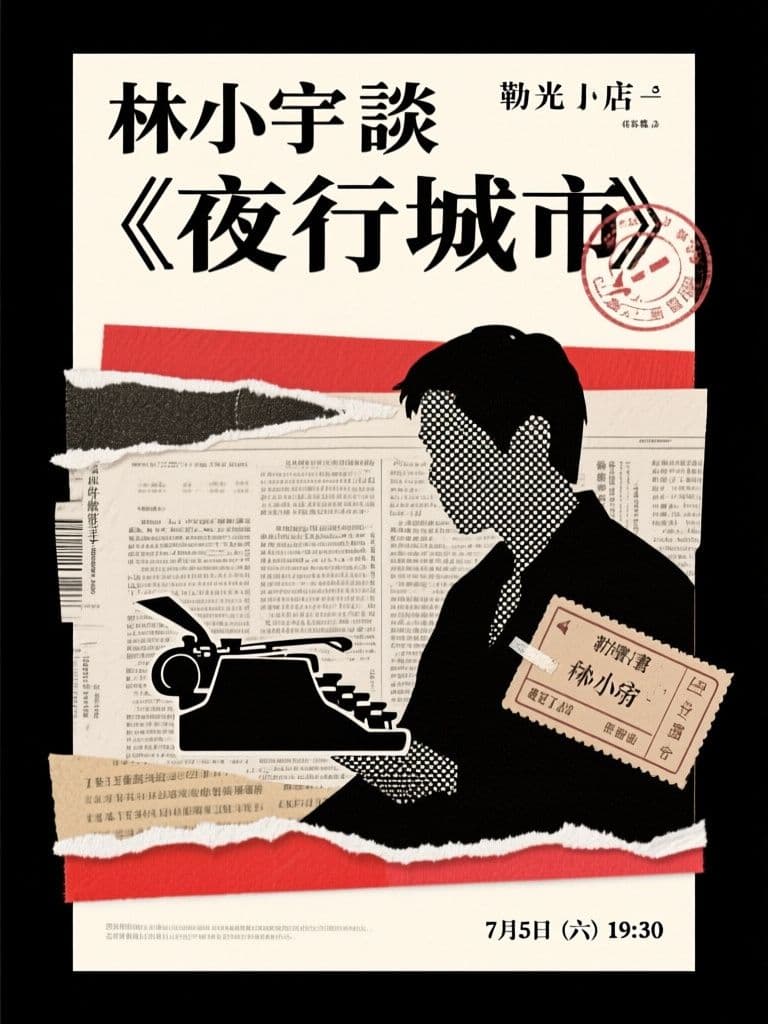
Bookstore Author Talk Poster (Paper Collage)
Collage roughness matches exactly what a literary audience finds authentic, and the ransom-note headline is inherently shareable — far more repostable than a templated event flyer.
 Posters
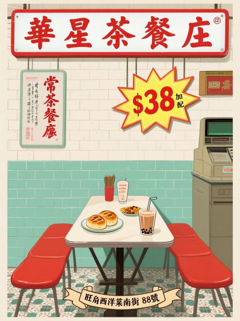
Cha Chaan Teng Anniversary Poster (Vintage Hong Kong)
Vintage Hong Kong aesthetics carry built-in emotional memory; pairing it with a fluorescent price starburst tells the heritage story and the deal in one glance.