
Beauty Salon Promo Poster (Editorial Minimal Luxe)
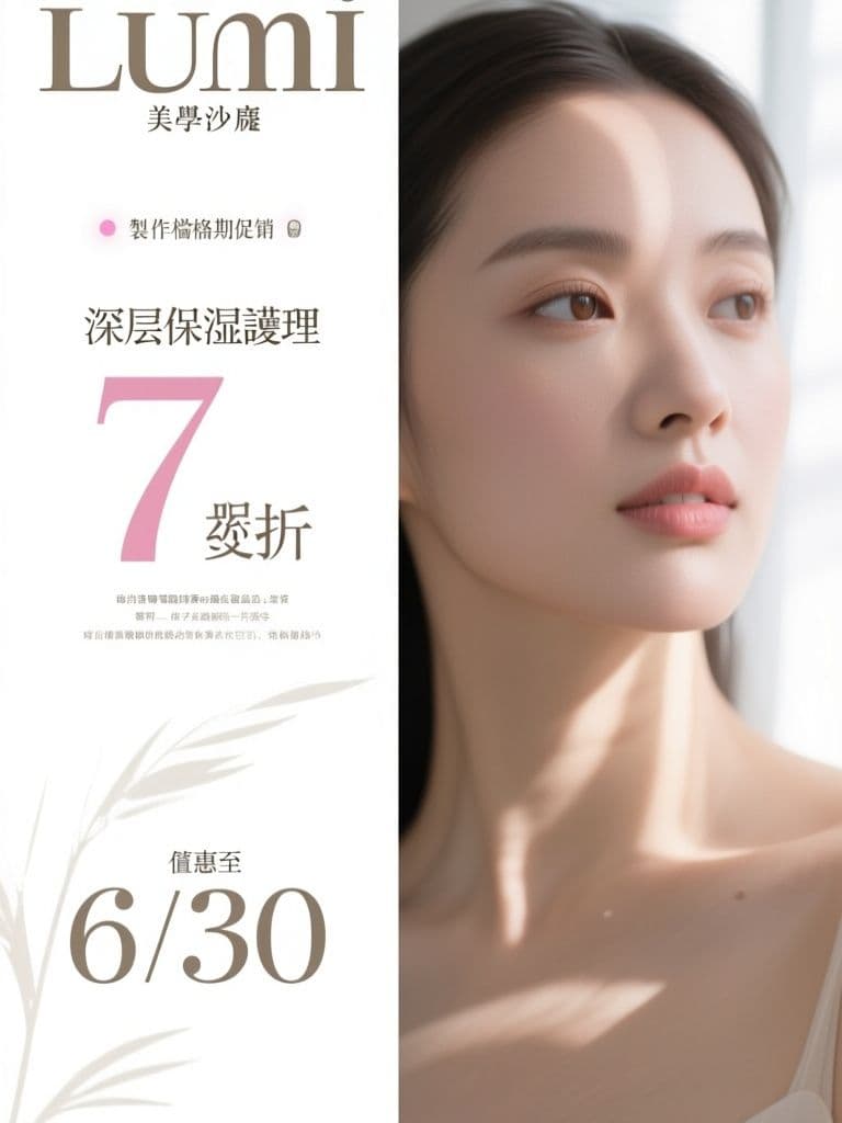
Whitespace and soft light make the discount feel premium instead of desperate — and the reserved left third takes your offer text cleanly, so one image covers both the storefront poster and Instagram Stories.
prompt
Create a seasonal promotion poster for {salon_name} promoting {treatment} at {discount} off until {end_date}. Style: editorial minimal luxe — it should look like a high-end magazine page: generous negative space, soft natural window light, a close-up beauty photograph with dewy skin tones, thin elegant serif typography placeholders, muted palette of ivory, sand and one blush accent, a single delicate botanical shadow falling across the frame. Vertical 2:3 ratio; keep the left third as clean negative space for the offer text overlay, photo anchored to the right. Calm, premium, aspirational — no loud starburst badges, no neon colors, no cluttered discount stickers.
Variables
This prompt uses the variables below. Fill them in when you hit Copy — anything left blank keeps its {placeholder}.
- {salon_name}Salon name
- e.g. Lumi 美學沙龍
- {treatment}Featured treatment
- e.g. 深層保濕護理
- {discount}Discount
- e.g. 7 折
- {end_date}Offer end date
- e.g. 6/30
Use case
Salon, spa and nail studio owners running seasonal offers who want premium-feeling promo visuals, not bargain-bin clutter.
Recommended tools
Contains affiliate links: we may earn a commission when you purchase or sign up through them, at no extra cost to you.
Related prompts
 Posters
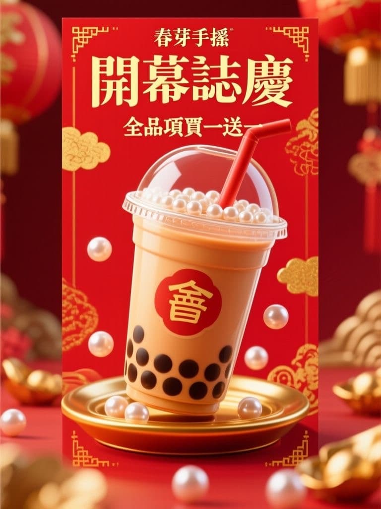
Bubble Tea Grand Opening Poster (Festive Red & Gold Pop)
Red-and-gold festivity reads as 'grand opening' at a glance, and the 3D drink hero stops foot traffic; the clean lower third lets you drop in your address and QR code without re-editing the artwork.
 Posters
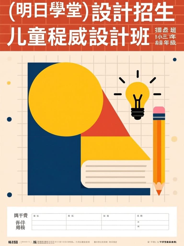
Tutoring Center Enrollment Poster (Bauhaus Geometric Style)
Bauhaus geometry stands out on a wall of generic tutoring flyers while still reading trustworthy to parents; the layout pre-reserves the bottom band for schedule and tuition — the first things parents look for.
 Posters
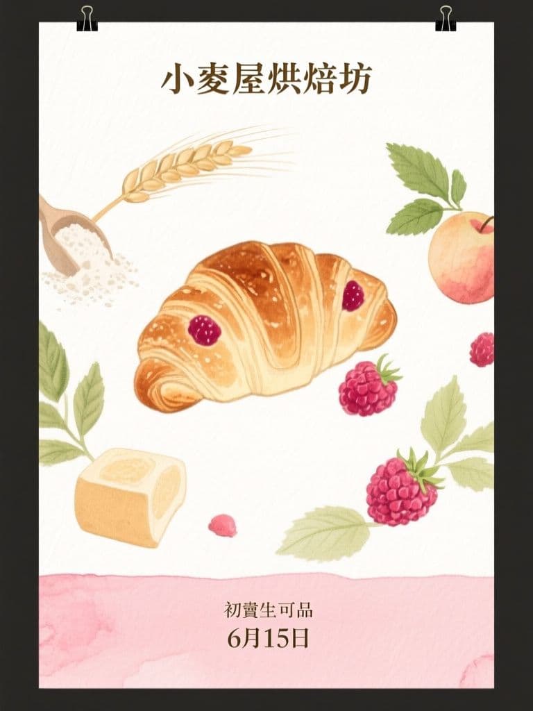
Bakery Seasonal Launch Poster (Soft Watercolor)
Watercolor illustration signals hand-made craft better than a product photo, and the orbiting-ingredients composition pulls the eye straight to the new item — artisan look without hiring an illustrator.
 Posters
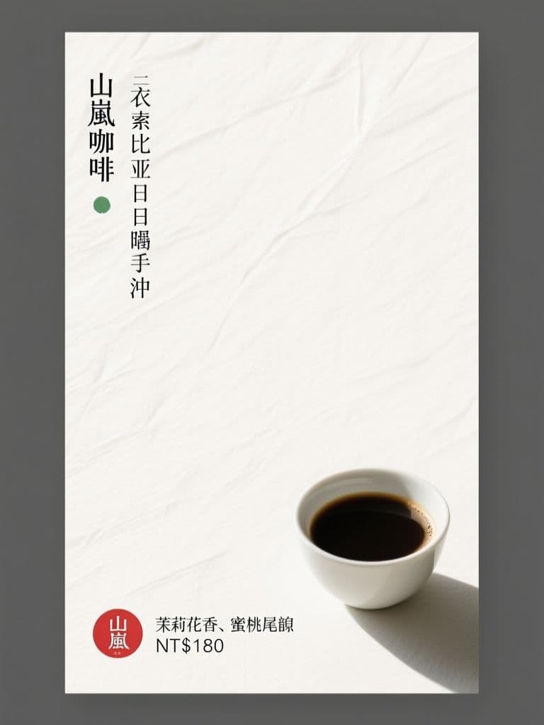
Cafe New Brew Poster (Japanese Minimalism)
Seventy percent negative space is what makes it stand out — minimalism reads as premium for specialty coffee, and the red hanko price stamp gives the eye one precise anchor point.
 Posters
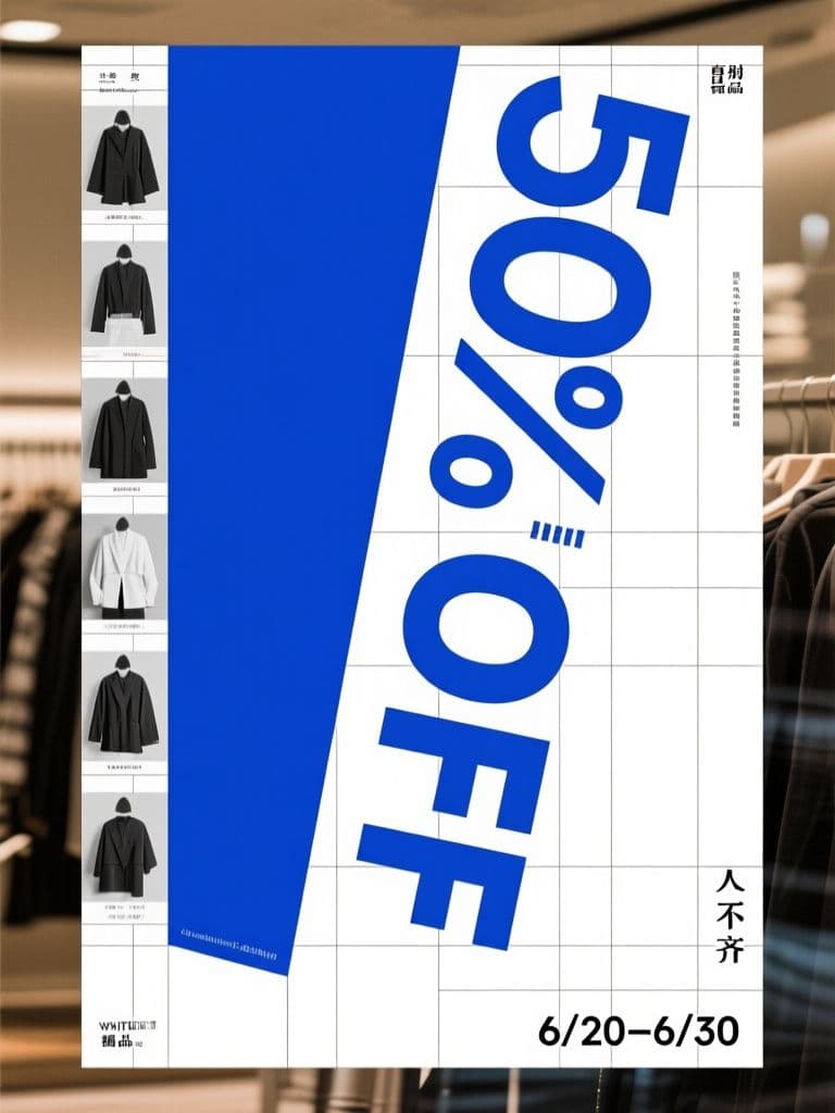
Boutique End-of-Season Sale Poster (Swiss Grid)
Turning the discount numeral itself into the rotated hero graphic is the classic Swiss conversion trick — the rational grid makes a markdown look like a designer drop, not a clearance bin.
 Posters
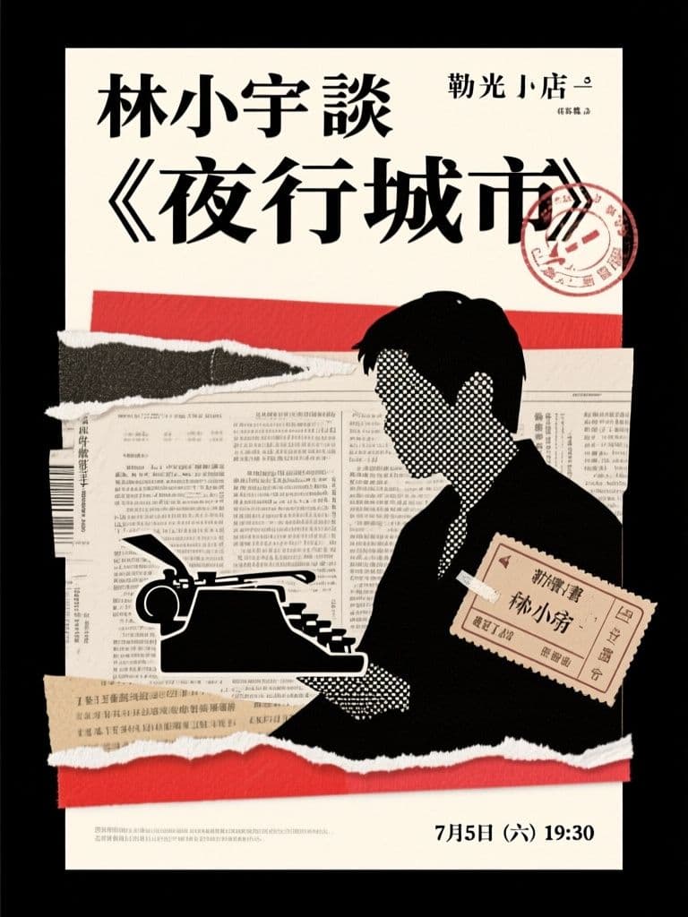
Bookstore Author Talk Poster (Paper Collage)
Collage roughness matches exactly what a literary audience finds authentic, and the ransom-note headline is inherently shareable — far more repostable than a templated event flyer.