
Kids Art Camp Poster (Paper Collage)
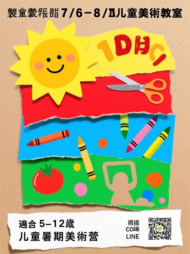
The torn-paper look feels like a child's own artwork, instantly selling parents on hands-on creativity, while the torn white strip keeps signup details legible against the busy background.
prompt
Make a playful cut-paper collage poster for {school_name} promoting a children's summer art camp running {camp_dates}. Build the scene from torn construction-paper shapes: a giant smiling sun, scissor-cut letters spelling the headline, crayon scribbles, paint splats and photographic cutouts of art supplies layered with visible drop shadows like a real scrapbook. Use a joyful palette of sunshine yellow, tomato red, sky blue and grass green on a kraft-paper background. Leave a torn white strip near the bottom for {age_range} and {signup_method}. Keep the layout busy but legible, with the headline occupying the top third. Vertical A4 portrait ratio, suitable for school bulletin boards and parent group chats.
Variables
This prompt uses the variables below. Fill them in when you hit Copy — anything left blank keeps its {placeholder}.
- {school_name}Name of the school or studio
- e.g. 小太陽兒童美術教室
- {camp_dates}Camp dates
- e.g. 7/6–8/21 每週一至五
- {age_range}Suitable age range
- e.g. 適合 5–12 歲
- {signup_method}How to sign up
- e.g. 掃描 QR Code 或 LINE 報名
Use case
Kids class operators and enrichment centers recruiting for summer camps via parent group chats and school boards.
Recommended tools
Contains affiliate links: we may earn a commission when you purchase or sign up through them, at no extra cost to you.
Related prompts
 Posters
Bubble Tea Grand Opening Poster (Festive Red & Gold Pop)
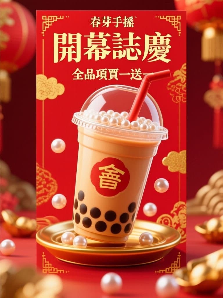
Red-and-gold festivity reads as 'grand opening' at a glance, and the 3D drink hero stops foot traffic; the clean lower third lets you drop in your address and QR code without re-editing the artwork.
 Posters
Tutoring Center Enrollment Poster (Bauhaus Geometric Style)
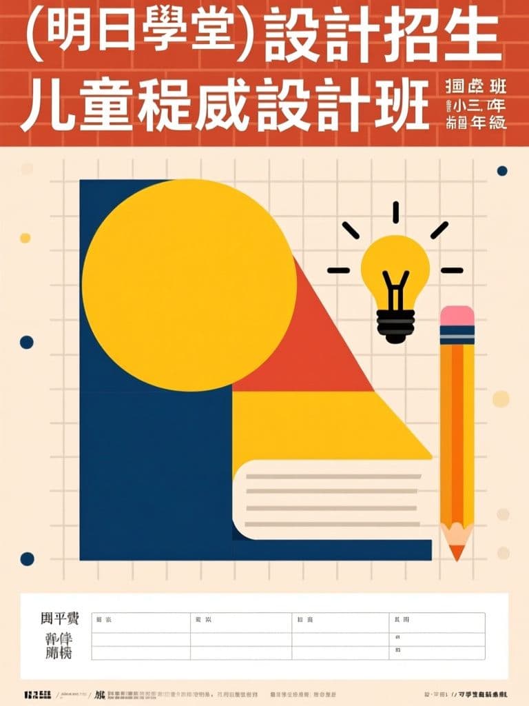
Bauhaus geometry stands out on a wall of generic tutoring flyers while still reading trustworthy to parents; the layout pre-reserves the bottom band for schedule and tuition — the first things parents look for.
 Posters
Bakery Seasonal Launch Poster (Soft Watercolor)
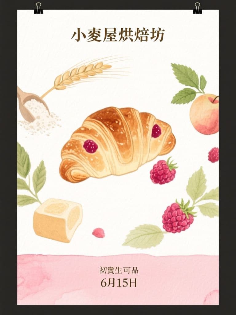
Watercolor illustration signals hand-made craft better than a product photo, and the orbiting-ingredients composition pulls the eye straight to the new item — artisan look without hiring an illustrator.
 Posters
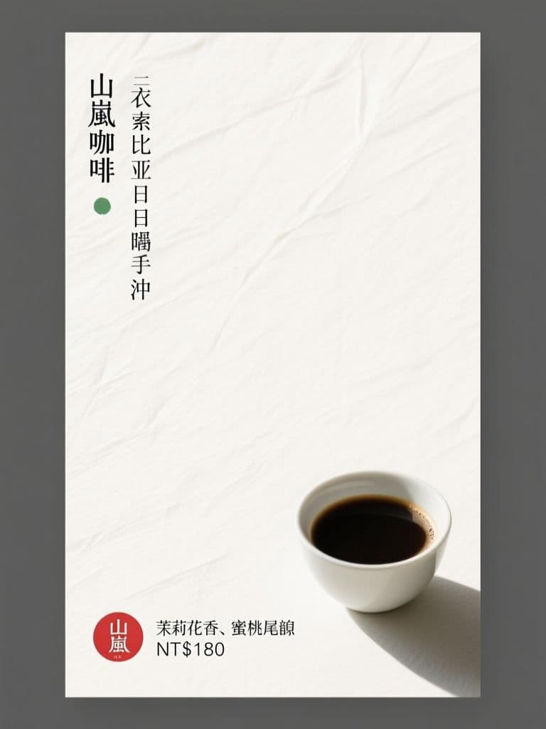
Cafe New Brew Poster (Japanese Minimalism)
Seventy percent negative space is what makes it stand out — minimalism reads as premium for specialty coffee, and the red hanko price stamp gives the eye one precise anchor point.
 Posters
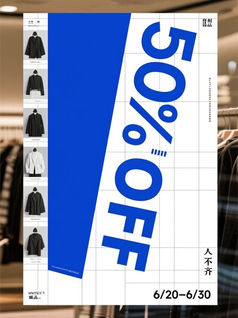
Boutique End-of-Season Sale Poster (Swiss Grid)
Turning the discount numeral itself into the rotated hero graphic is the classic Swiss conversion trick — the rational grid makes a markdown look like a designer drop, not a clearance bin.
 Posters
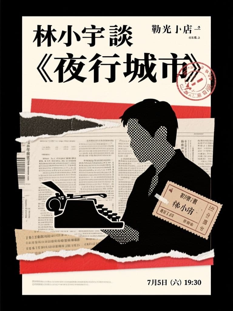
Bookstore Author Talk Poster (Paper Collage)
Collage roughness matches exactly what a literary audience finds authentic, and the ransom-note headline is inherently shareable — far more repostable than a templated event flyer.