
Property Management Door Hanger (Flat Illustration)
A door hanger lands directly in a landlord's hand with zero ad competition, and the friendly illustration disarms the usual cold-pitch resistance to property managers.
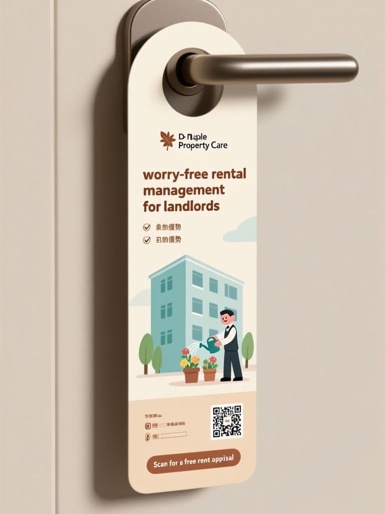
prompt
Design a vertical door hanger flyer for property management company {company_name}, targeting landlords in {neighborhood}. Format: tall 1:3 portrait with a rounded die-cut hole shape at the top, shown on a plain background as a print mockup. Style: cheerful flat illustration — a tidy apartment building with a small caretaker figure watering plants, warm cream backdrop, muted teal and terracotta palette. Middle section: bold rounded headline promoting {main_service}, then three checkmark bullet benefits. Bottom quarter stays a solid pale block, intentionally empty for phone, price and QR overlay. End with the call-to-action {cta_text} in a pill-shaped button graphic. Soft shadows, screen-print texture, approachable not corporate.
Variables
This prompt uses the variables below. Fill them in when you hit Copy — anything left blank keeps its {placeholder}.
- {company_name}Property management company name
- e.g. Maple Property Care
- {neighborhood}Target neighborhood or district
- e.g. Da'an District
- {main_service}Headline service offering
- e.g. worry-free rental management for landlords
- {cta_text}Call-to-action text
- e.g. Scan for a free rent appraisal
Use case
Property management companies canvassing residential neighborhoods door-to-door to sign up new landlord clients.
Recommended tools
Contains affiliate links: we may earn a commission when you purchase or sign up through them, at no extra cost to you.
Related prompts
 Flyers
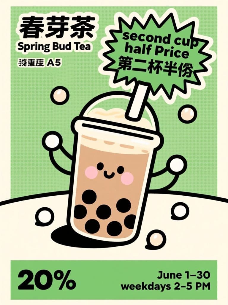
Bubble Tea 'Second Cup Half Price' Flyer (Pop Art Illustration)
A starburst badge plus one cartoon hero cup is the highest-converting layout for street handouts — passersby grasp the deal in under two seconds, and the reserved bottom band lets you drop in store info without redesigning.
 Flyers
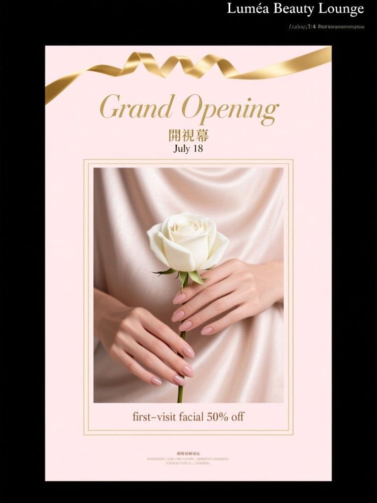
Beauty Salon Grand Opening Flyer (Soft Luxury Editorial)
Blush-and-gold with heavy negative space signals 'premium' before anyone reads a word, so your opening offer feels like an invitation rather than a discount — perfect for salons priced above market rate.
 Flyers
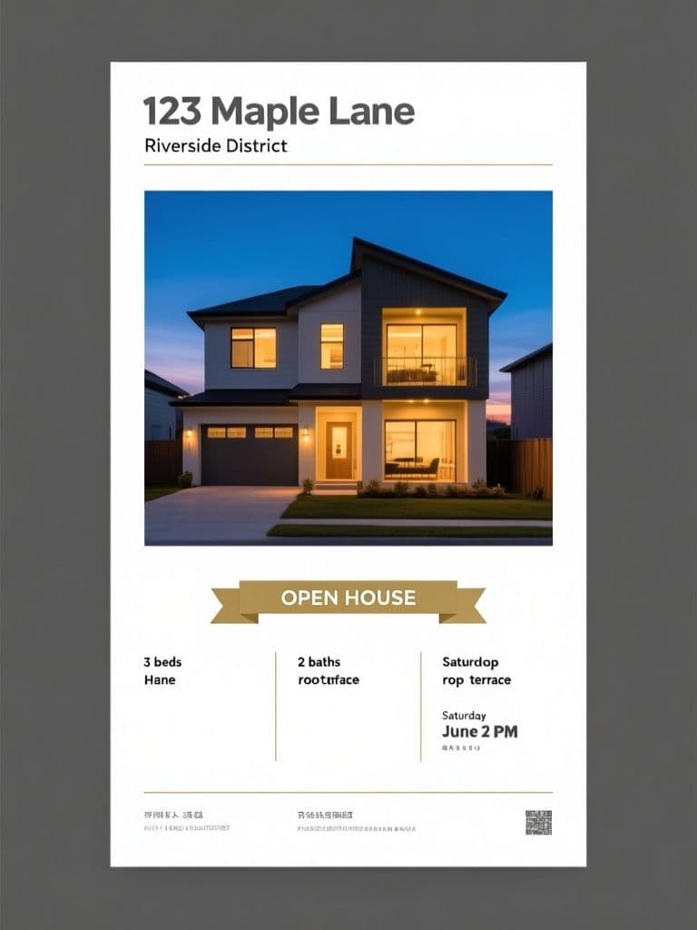
Real Estate Open House Flyer (Twilight Architecture Shot)
Twilight exteriors consistently outperform daytime photos in listing engagement — the warm-window-glow effect makes any property feel aspirational, while the three-column info panel keeps the flyer scannable at arm's length.
 Flyers
Tutoring Center Enrollment Flyer (Flat Illustration)
Navy-plus-yellow is the proven 'credible but friendly' combo for education marketing — parents read trust, kids read fun — and the ticket-stub callout makes the early-bird perk feel like a real coupon that drives enrollment calls.
 Flyers
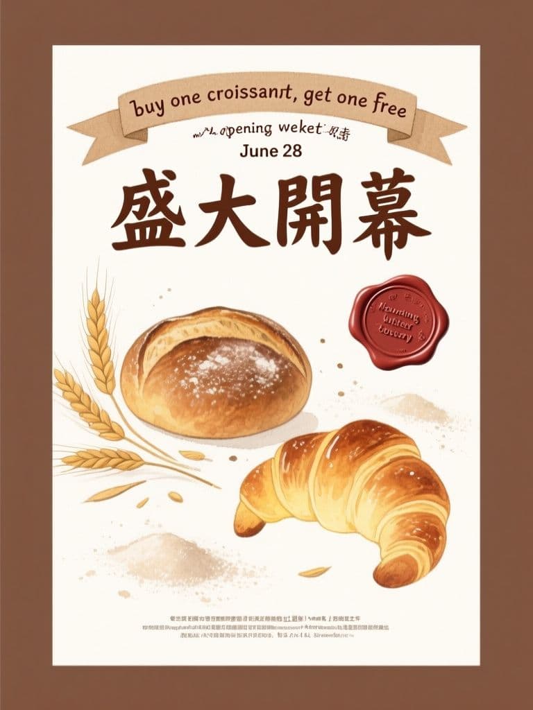
Artisan Bakery Opening Flyer (Kraft Watercolor)
Kraft texture and watercolor pastries instantly signal handmade quality, the wax-seal offer badge reads like a limited invitation, and the reserved bottom band lets you drop in contact details with zero rework.
 Flyers
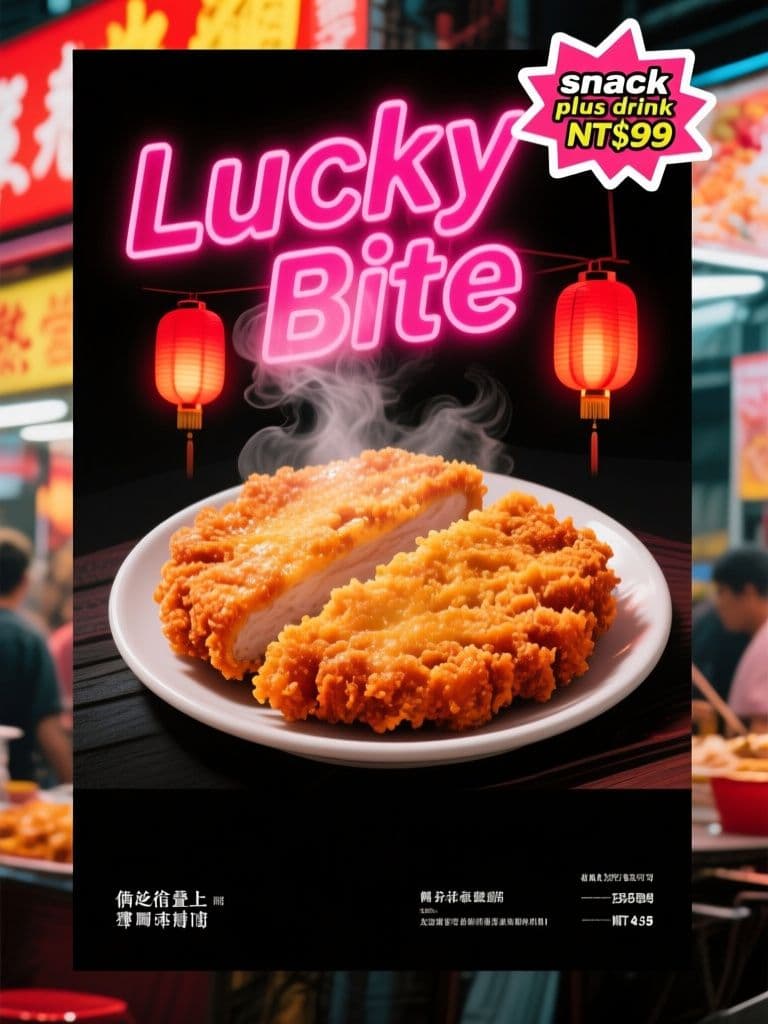
Night Market Snack Handbill (Neon Street Style)
Neon-on-dark styling makes the hero snack pop in a crowded street, the starburst sticker speaks the promo language night-market customers already trust, and the black bottom band swaps prices without redoing the art.