
Yoga Studio Morning Flow Poster (Japanese Minimal)
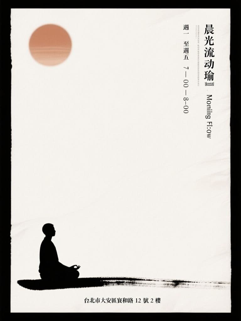
Two-thirds negative space plus a single ink-stroke figure makes the schedule pop while signalling calm — premium studio vibes in one generation.
prompt
Create a Japanese minimalist poster for {studio_name} promoting a morning yoga class called {class_name}. Composition: vast off-white negative space covering two-thirds of the canvas, with a single small silhouette of a person in a seated meditation pose placed low and off-center, drawn in one continuous sumi-e ink brushstroke. A pale sun circle in muted terracotta floats above. Vertical typography along the right edge lists {class_schedule}, with {studio_address} in small letterpress-style type at the bottom. Use a restrained palette of warm white, ink black and terracotta only. Calm, breathable, wabi-sabi texture like handmade paper. Output in 2:3 vertical poster ratio, print quality.
Variables
This prompt uses the variables below. Fill them in when you hit Copy — anything left blank keeps its {placeholder}.
- {studio_name}Name of the yoga studio
- e.g. 靜山瑜珈 Stillhill Yoga
- {class_name}Name of the class
- e.g. 晨光流動瑜珈 Morning Flow
- {class_schedule}Class schedule
- e.g. 週一至週五 7:00–8:00
- {studio_address}Studio address
- e.g. 台北市大安區安和路 12 號 2 樓
Use case
Yoga or pilates studio owners promoting a new morning class or trial sessions at the door and online.
Recommended tools
Contains affiliate links: we may earn a commission when you purchase or sign up through them, at no extra cost to you.
Related prompts
 Posters
Bubble Tea Grand Opening Poster (Festive Red & Gold Pop)
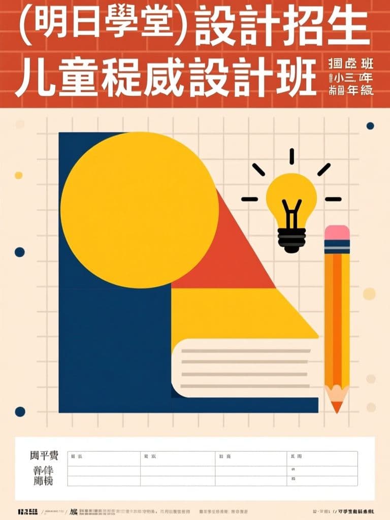
Red-and-gold festivity reads as 'grand opening' at a glance, and the 3D drink hero stops foot traffic; the clean lower third lets you drop in your address and QR code without re-editing the artwork.
 Posters
Tutoring Center Enrollment Poster (Bauhaus Geometric Style)
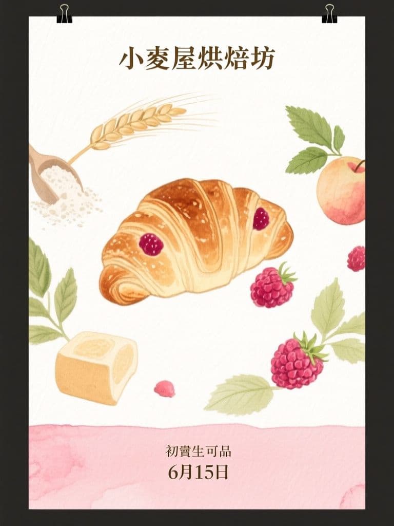
Bauhaus geometry stands out on a wall of generic tutoring flyers while still reading trustworthy to parents; the layout pre-reserves the bottom band for schedule and tuition — the first things parents look for.
 Posters
Bakery Seasonal Launch Poster (Soft Watercolor)
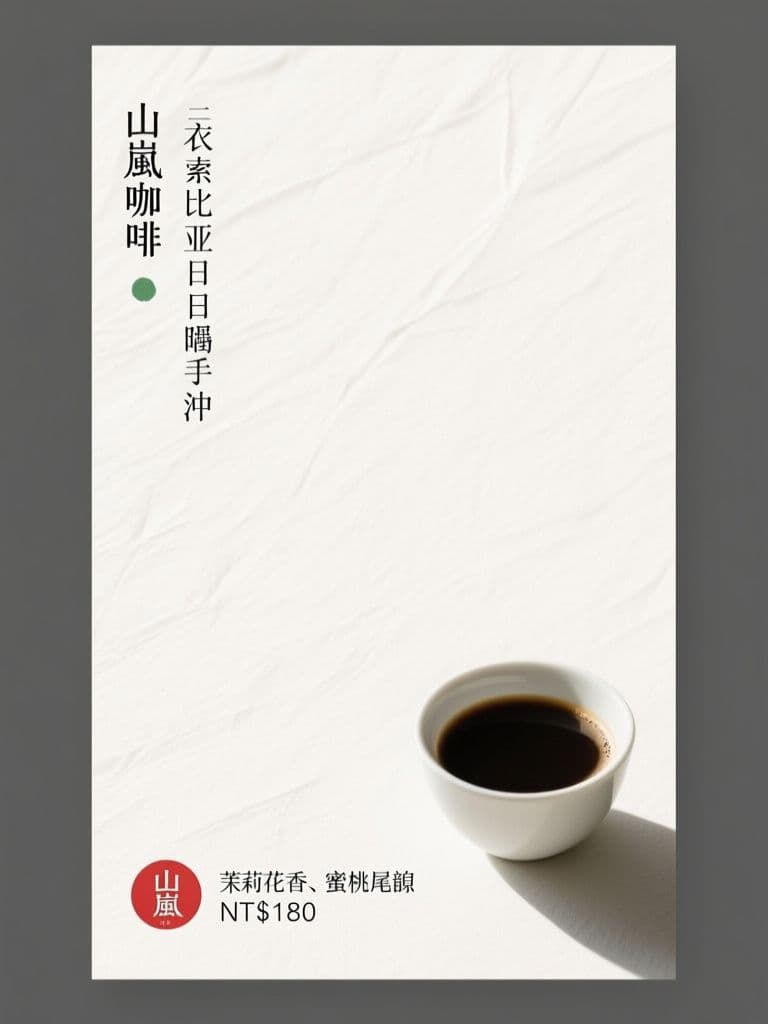
Watercolor illustration signals hand-made craft better than a product photo, and the orbiting-ingredients composition pulls the eye straight to the new item — artisan look without hiring an illustrator.
 Posters
Cafe New Brew Poster (Japanese Minimalism)
Seventy percent negative space is what makes it stand out — minimalism reads as premium for specialty coffee, and the red hanko price stamp gives the eye one precise anchor point.
 Posters
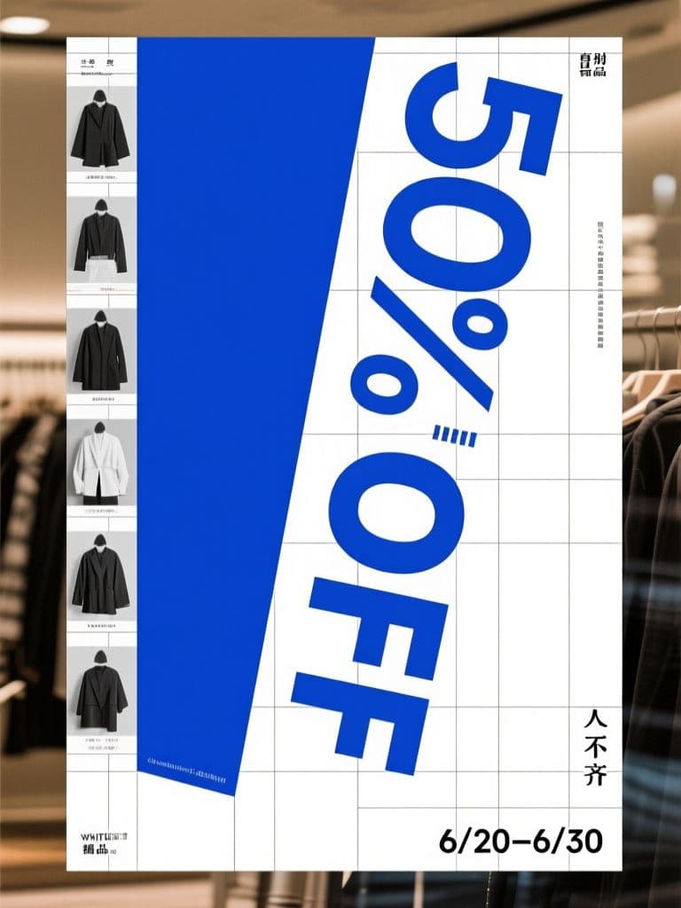
Boutique End-of-Season Sale Poster (Swiss Grid)
Turning the discount numeral itself into the rotated hero graphic is the classic Swiss conversion trick — the rational grid makes a markdown look like a designer drop, not a clearance bin.
 Posters
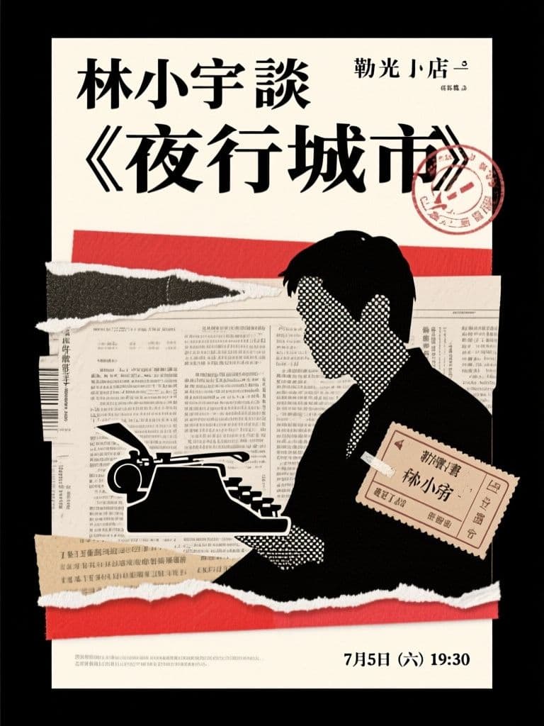
Bookstore Author Talk Poster (Paper Collage)
Collage roughness matches exactly what a literary audience finds authentic, and the ransom-note headline is inherently shareable — far more repostable than a templated event flyer.