
App Install Banner (3D Gradient Phone Mockup)
The tilted phone mockup plus left-side negative space is the classic install-ad layout that survives every text overlay — you get an on-spec 1.91:1 banner without ever opening a design tool.
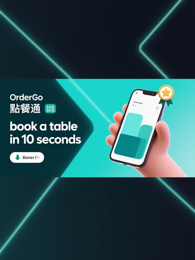
prompt
Create a horizontal app-install banner for {app_name}, a {app_category} app. Composition: a floating smartphone mockup in the right third, tilted 15 degrees with a soft drop shadow, its screen showing a clean abstract UI in {brand_color} tones — simple blocks and cards, no readable text. Fill the left two-thirds with a smooth {brand_color}-to-dark gradient, with subtle 3D geometric shapes and light streaks pushed toward the edges to suggest speed and ease. Float one small star-rating badge beside the phone. Modern SaaS aesthetic, crisp edges, gentle depth-of-field glow. Render in 1200x628 landscape (1.91:1) for social link ads, keeping the left half visually clear for a headline, subline and download button that will highlight {key_benefit}.
Variables
This prompt uses the variables below. Fill them in when you hit Copy — anything left blank keeps its {placeholder}.
- {app_name}Name of the app
- e.g. OrderGo 點餐通
- {app_category}Category of the app
- e.g. restaurant table-booking
- {brand_color}Primary brand color
- e.g. teal
- {key_benefit}Key benefit the overlay copy will highlight
- e.g. book a table in 10 seconds
Use case
An indie app developer or SaaS marketer preparing install-campaign banners for social link ads on a tight timeline.
Recommended tools
Contains affiliate links: we may earn a commission when you purchase or sign up through them, at no extra cost to you.
Related prompts
 Ad Images
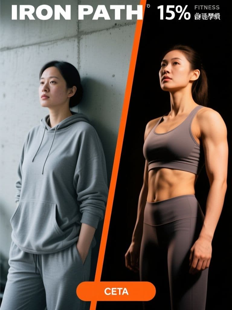
Fitness Before/After Ad (Split-Screen Light Contrast)
The cold-versus-warm lighting contrast tells the transformation story before anyone reads a word, and the reserved top and bottom strips mean your headline and CTA drop in cleanly without fighting the photo.
 Ad Images
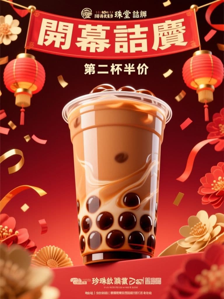
Bubble Tea Grand Opening Hero (Red-Gold Festive)
Red-and-gold opening visuals are conversion shorthand across Taiwan and Hong Kong — this prompt nails the festive cues while keeping the layout clean enough for your offer text, skipping a round-trip to a designer.
 Ad Images
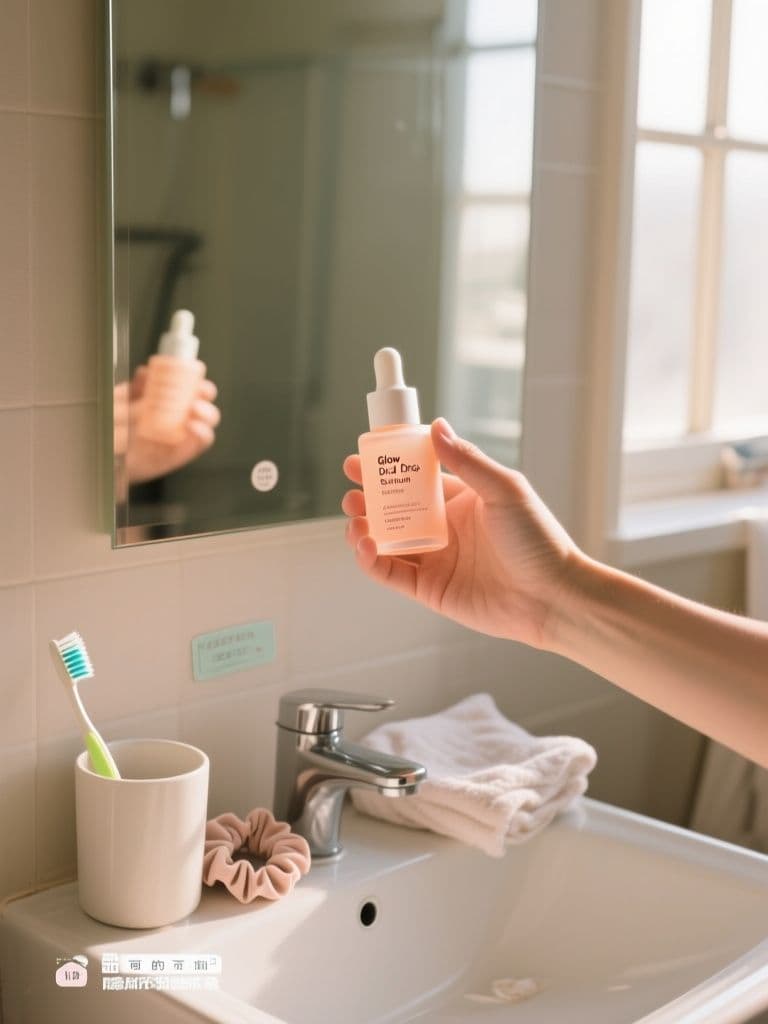
UGC Skincare Lifestyle Ad (Phone-Shot Authentic)
Polished studio ads get scrolled past — this prompt engineers the real-customer-photo cues (grain, mess, window light) that make feed audiences stop, while the quiet lower third leaves room for price stickers and captions.
 Ad Images
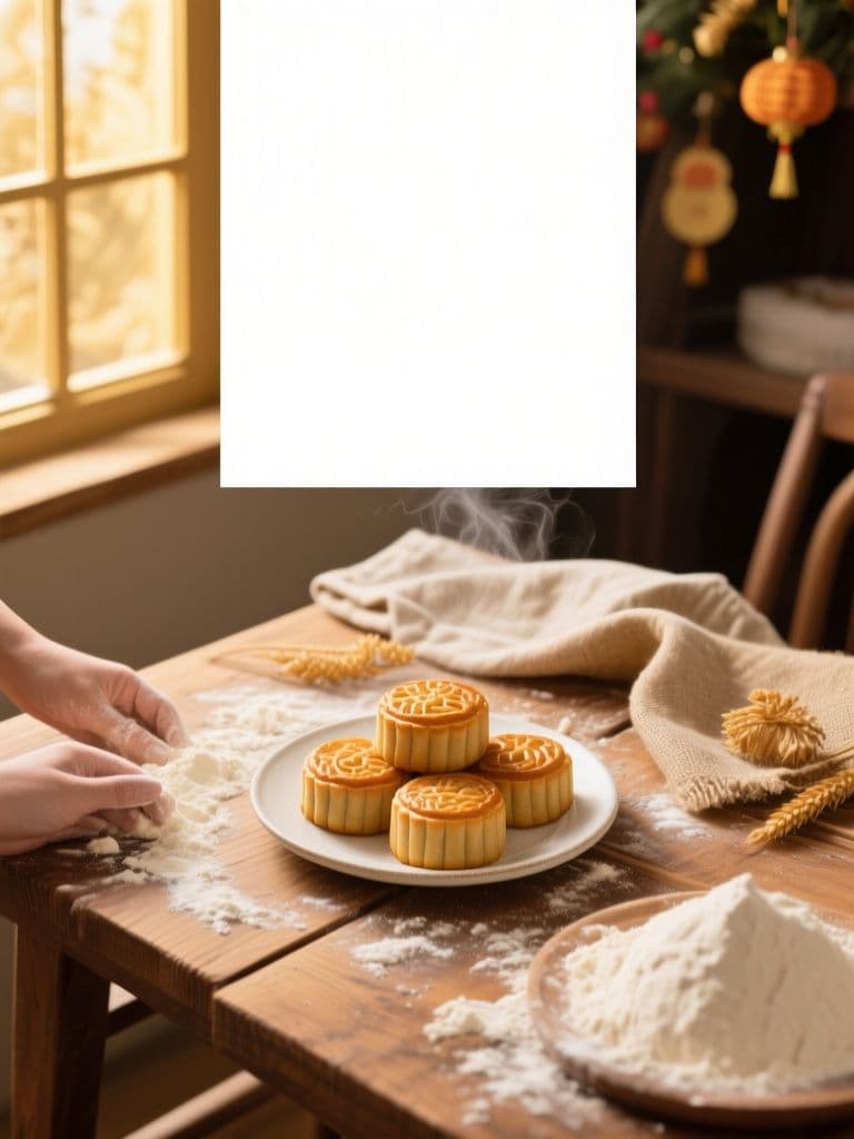
Bakery Holiday Sale Hero (Rustic Flat-Lay)
The quiet top-third safe margin plus appetite-driven flat-lay composition lets you drop seasonal copy straight onto the image — one generation replaces a photographer, stylist, and designer for every holiday push.
 Ad Images
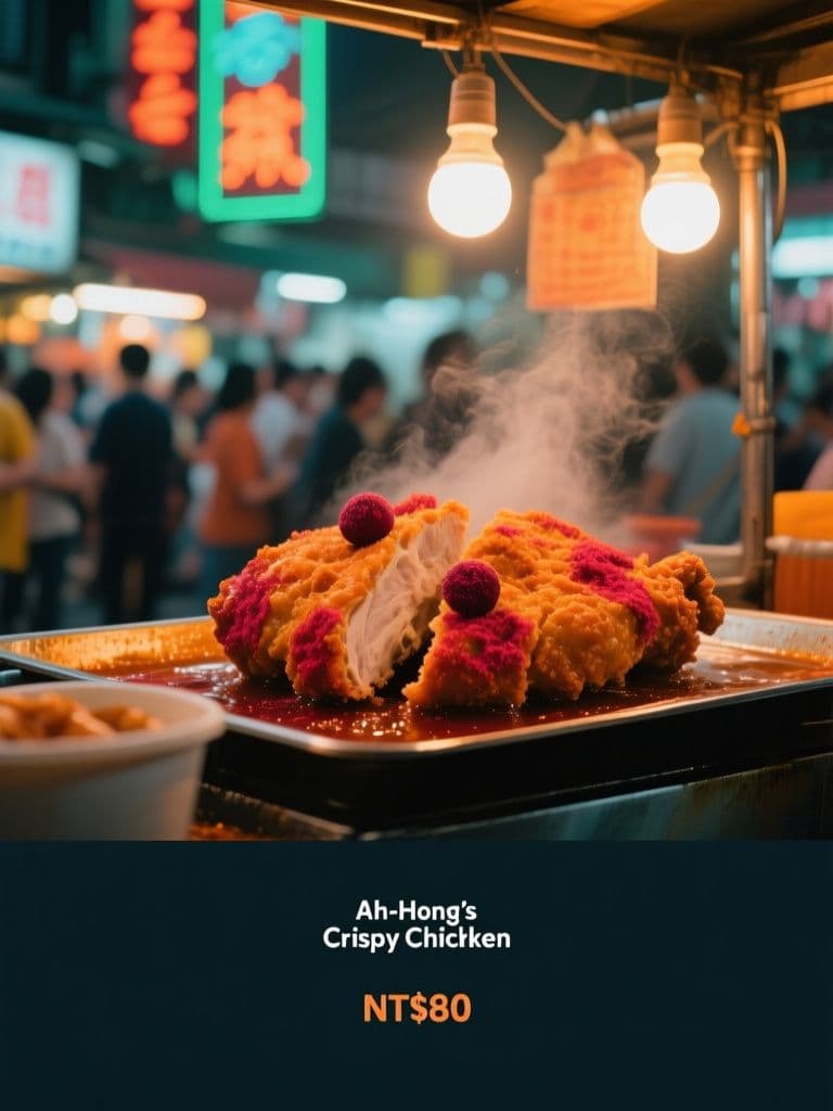
Night Market Stall Ad (Neon Street Cinematic)
Teal-and-orange neon grading plus crowd bokeh signals 'authentic street food worth queuing for', while the built-in dark gradient band keeps your price copy legible at feed-scroll speed.
 Ad Images
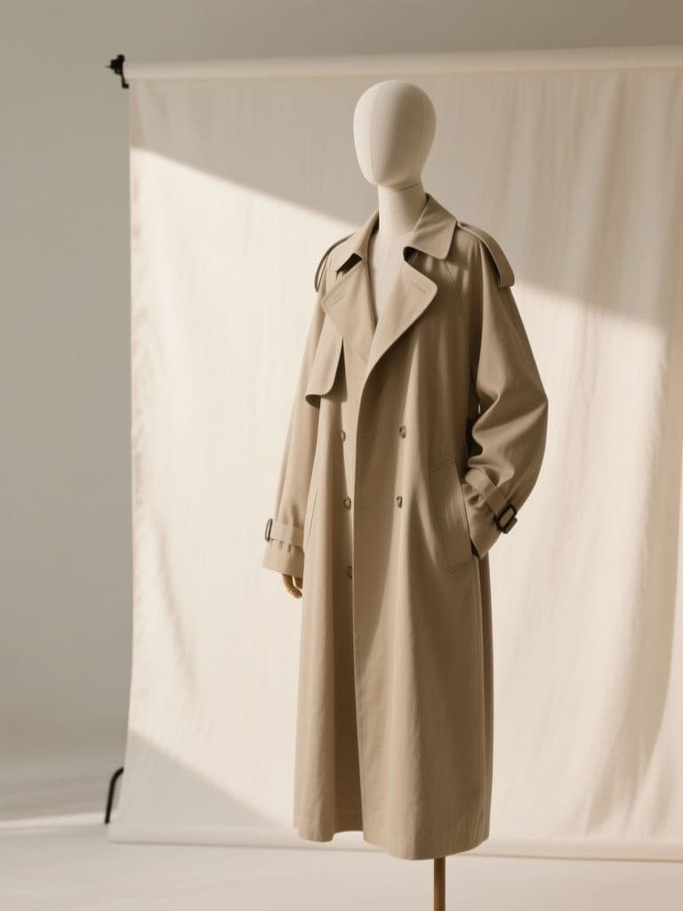
Boutique Carousel Ad Cover (Minimal Editorial)
A disciplined cover card with fixed negative space makes the whole carousel read like a magazine spread — shoppers swipe further when card one feels premium, and the reserved left third keeps copy placement consistent.