
UGC Skincare Lifestyle Ad (Phone-Shot Authentic)
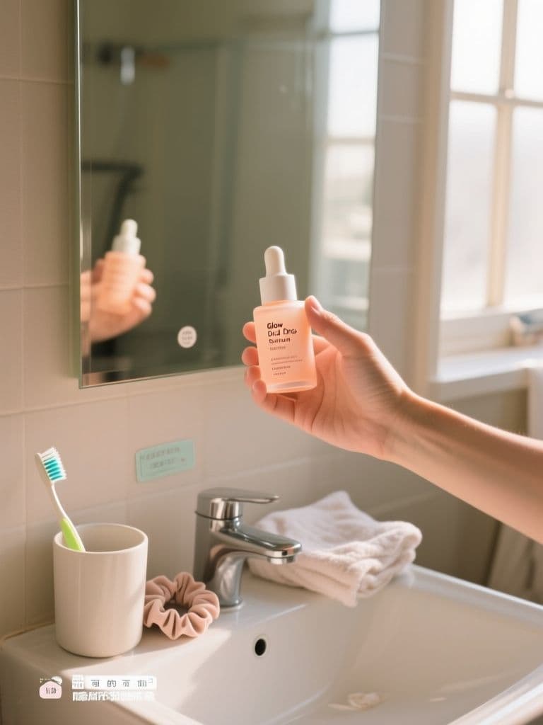
Polished studio ads get scrolled past — this prompt engineers the real-customer-photo cues (grain, mess, window light) that make feed audiences stop, while the quiet lower third leaves room for price stickers and captions.
prompt
Generate a UGC-style lifestyle ad photo for {product_name}, a {product_type}. Scene: a hand holding the product toward the camera over a bright, slightly messy bathroom counter — morning window light, soft shadows, casual everyday energy. It should look like a phone photo a real customer posted: light grain, natural skin texture, shallow focus on the bottle with a generic label and no real brand marks. Add lived-in details such as {background_props}. Square 1:1 ratio for feed placement, keeping the lower third visually quiet so a caption sticker and price tag can be overlaid. Color grade leaning {color_mood}. Avoid studio-perfect lighting — believable imperfection is the entire point of this creative.
Variables
This prompt uses the variables below. Fill them in when you hit Copy — anything left blank keeps its {placeholder}.
- {product_name}Product name
- e.g. Glow Drop Serum
- {product_type}Type of product
- e.g. vitamin C facial serum
- {background_props}Lived-in props in the background
- e.g. a toothbrush cup, a folded towel and a hair scrunchie
- {color_mood}Overall color grade direction
- e.g. warm cream and soft peach
Use case
A skincare or beauty brand marketer who needs authentic-looking creatives for UGC-style paid social testing at volume.
How to use it
Fill four variables: {product_name} is the product (e.g. 'Glow Drop Serum'), {product_type} the category (e.g. 'vitamin C facial serum'), {background_props} the lived-in clutter on the counter (a toothbrush cup, a folded towel, a hair scrunchie), and {color_mood} the grade direction (e.g. 'warm cream and soft peach'). Run it on midjourney first — it is the strongest at the grainy, real-customer-photo texture this creative depends on. Gemini-image works too but tends to over-clean the shot, so add 'keep the grain and the slight mess' if you use it. Neither model spells real text reliably, which is exactly why the lower third is left quiet — bring the result into Canva afterwards and layer your price tag and caption sticker on top. Generate a small batch and pick the most believable frame for your A/B test.
Why it works
The whole design is anti-studio: it strips out every cue that screams 'ad' — demanding grain, natural skin texture, shallow focus, soft morning shadows, even a 'slightly messy counter' — because feeds and human eyes both flinch at compositions that are too perfect. Asking for a 'generic label with no real brand marks' does double duty: it dodges trademark trouble and lets one template carry any product. The load-bearing line is 'keep the lower third visually quiet' — that is not an aesthetic note but a layer reservation. Since the model cannot be trusted to render legible text, the prompt clears that zone so you can drop a crisp price and call-to-action on later, rather than gambling on a misspelled caption baked into the image.
Tips & variations
- For a vertical story, change 'square 1:1' to '9:16 portrait' and split the quiet zone into a top and a bottom band so a headline sits up top and a swipe-up arrow at the bottom.
- {background_props} drives believability: 'a half-open makeup bag, a used cotton pad, a phone left face-down' reads more like a real snapshot than tidy props; for a clean Japanese look, swap in 'a small potted plant and one plain towel'.
- {color_mood} is your emotional dial — 'cool morning light, pale blue-grey' signals clean clinical care, while 'warm amber, sunset gold' signals rich repair; run one of each for the same product and test which gets the higher click rate.
- Midjourney occasionally mangles the hand — pick the frame with natural fingers, or add 'only one relaxed hand in frame, fingers loose' to the prompt to cut the failure rate.
Recommended tools
Contains affiliate links: we may earn a commission when you purchase or sign up through them, at no extra cost to you.
Related prompts
 Ad Images
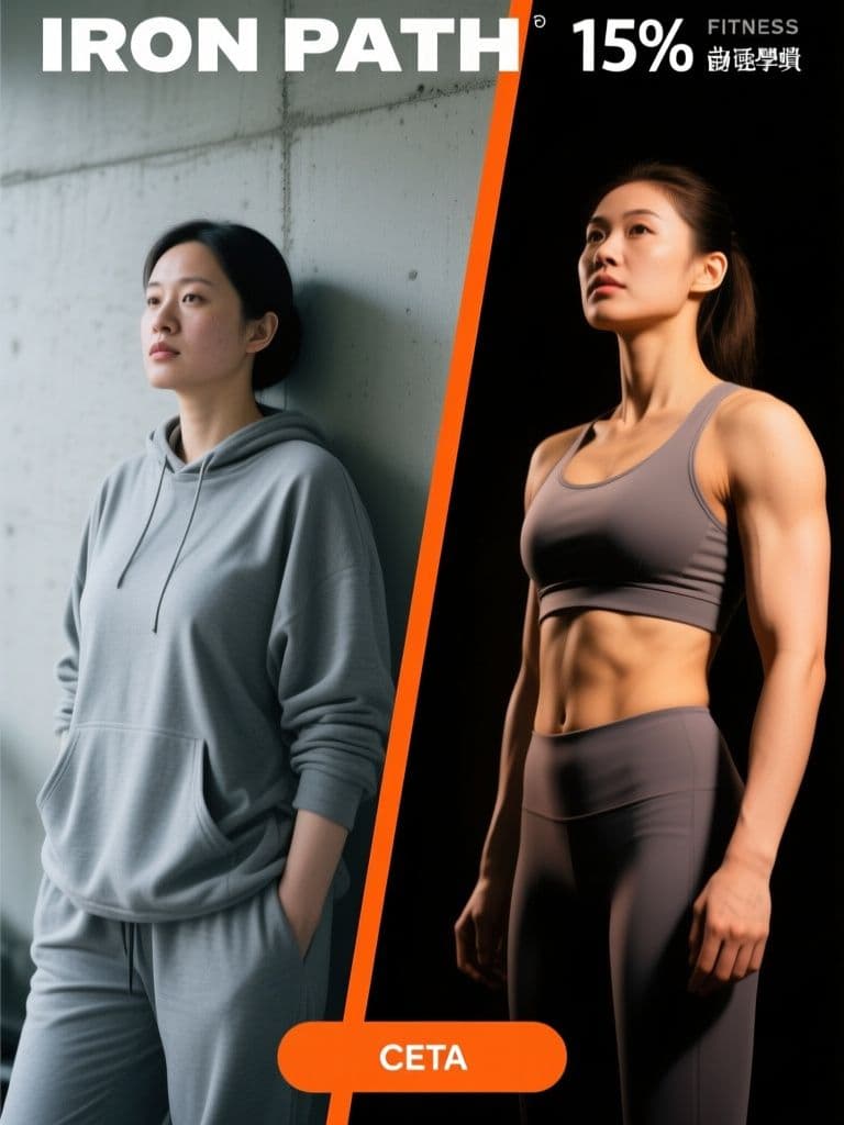
Fitness Before/After Ad (Split-Screen Light Contrast)
The cold-versus-warm lighting contrast tells the transformation story before anyone reads a word, and the reserved top and bottom strips mean your headline and CTA drop in cleanly without fighting the photo.
 Ad Images
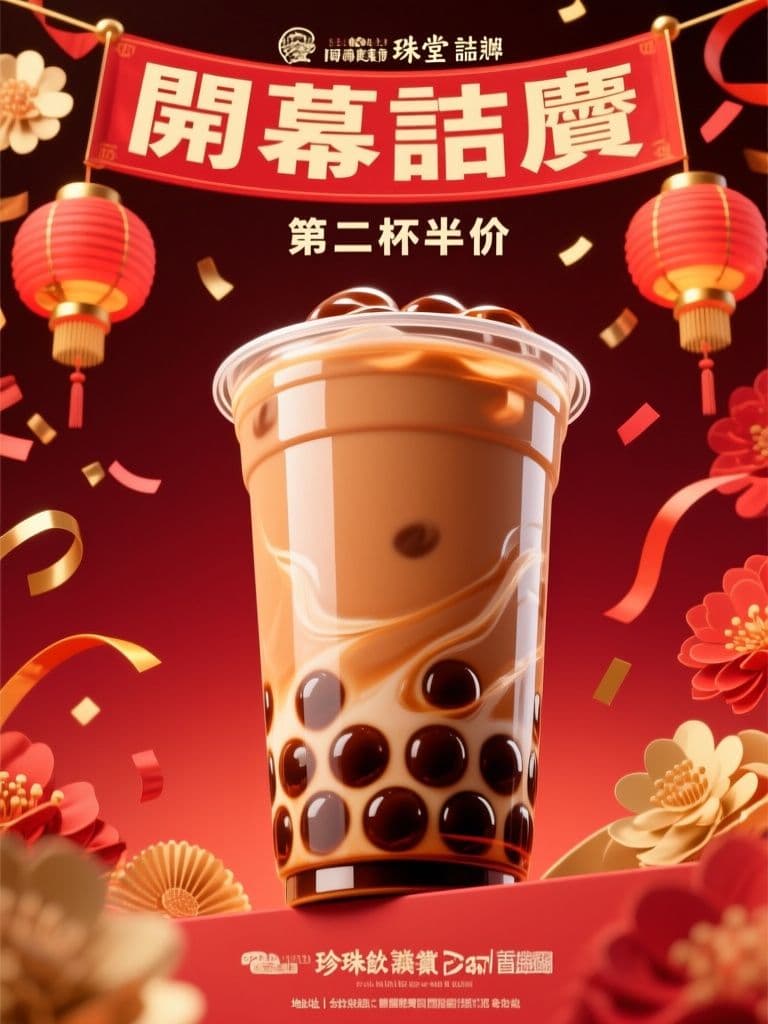
Bubble Tea Grand Opening Hero (Red-Gold Festive)
Red-and-gold opening visuals are conversion shorthand across Taiwan and Hong Kong — this prompt nails the festive cues while keeping the layout clean enough for your offer text, skipping a round-trip to a designer.
 Ad Images
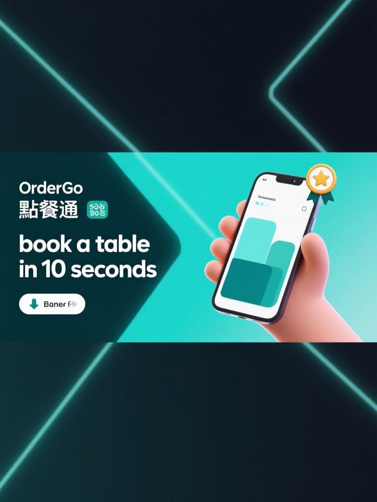
App Install Banner (3D Gradient Phone Mockup)
The tilted phone mockup plus left-side negative space is the classic install-ad layout that survives every text overlay — you get an on-spec 1.91:1 banner without ever opening a design tool.
 Ad Images
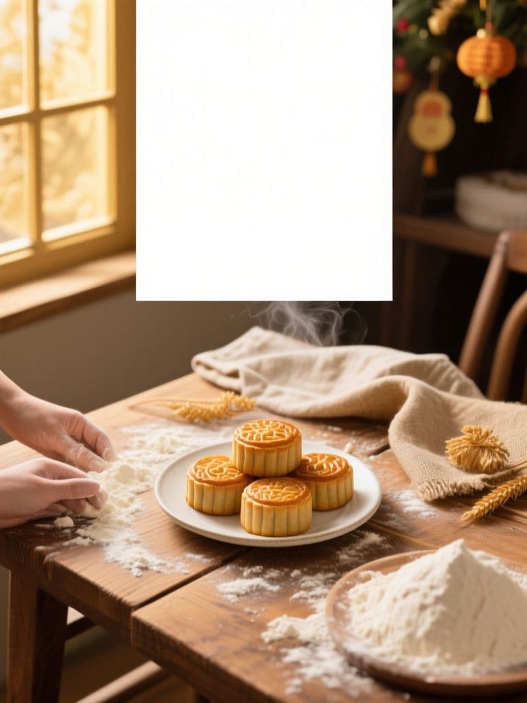
Bakery Holiday Sale Hero (Rustic Flat-Lay)
The quiet top-third safe margin plus appetite-driven flat-lay composition lets you drop seasonal copy straight onto the image — one generation replaces a photographer, stylist, and designer for every holiday push.
 Ad Images
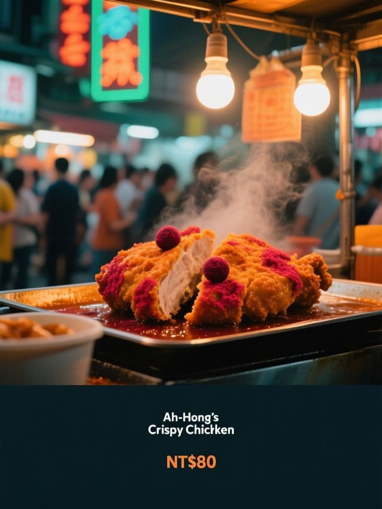
Night Market Stall Ad (Neon Street Cinematic)
Teal-and-orange neon grading plus crowd bokeh signals 'authentic street food worth queuing for', while the built-in dark gradient band keeps your price copy legible at feed-scroll speed.
 Ad Images
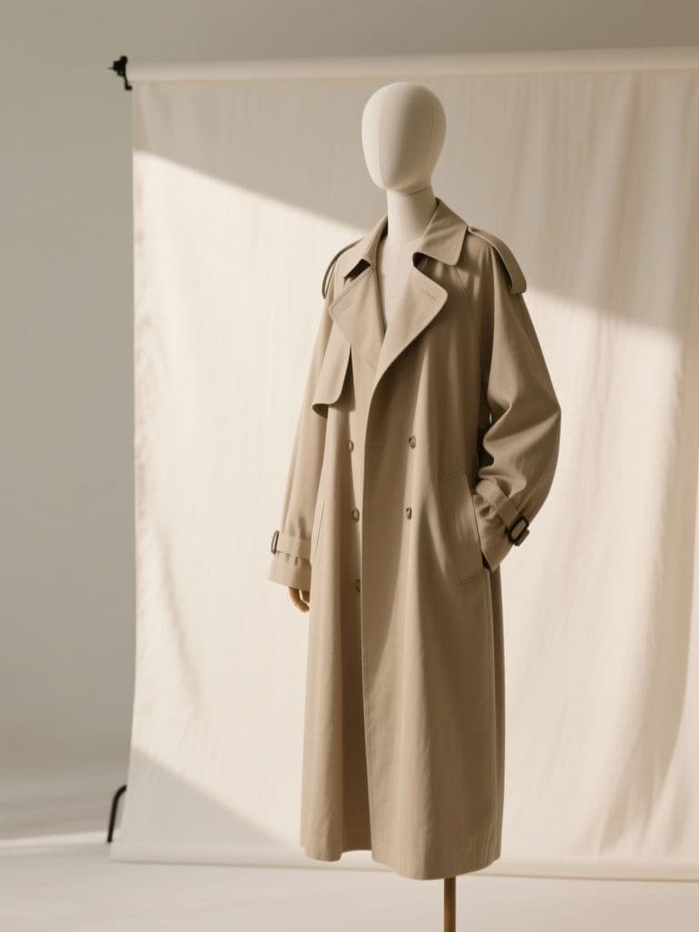
Boutique Carousel Ad Cover (Minimal Editorial)
A disciplined cover card with fixed negative space makes the whole carousel read like a magazine spread — shoppers swipe further when card one feels premium, and the reserved left third keeps copy placement consistent.