
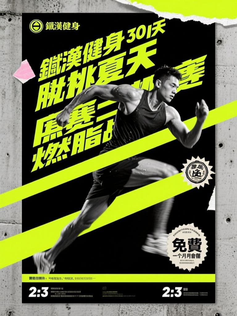
Gym Challenge Poster (Bold Brutalist Athletic Style)
Diagonal oversized type and harsh contrast read as intensity even from across the street, doing the 'sign up or miss out' psychology for you; the clean bottom strip is pre-reserved for dates and sign-up details.
prompt
Create a promotional poster for {challenge_name}, a {duration} fitness challenge at {gym_name}. Style: bold brutalist athletic design — oversized condensed sans-serif typography placeholder blocks stacked diagonally, high-contrast black and {accent_color} palette, gritty halftone photo treatment of an athlete mid-movement, raw concrete texture background, distressed grain overlay. Add a torn-sticker badge for the prize {prize}. Vertical 2:3 ratio with strong diagonal energy lines; keep a clean horizontal strip across the bottom for dates and sign-up details. The mood is intense and motivating — sweat, motion blur, dramatic side lighting, zero soft pastel elements.
Variables
This prompt uses the variables below. Fill them in when you hit Copy — anything left blank keeps its {placeholder}.
- {challenge_name}Challenge name
- e.g. 夏日燃脂挑戰
- {duration}Duration
- e.g. 30 天
- {gym_name}Gym name
- e.g. 鐵漢健身
- {accent_color}Accent color
- e.g. 螢光黃
- {prize}Prize
- e.g. 免費一個月會籍
Use case
Gym owners and personal trainers launching a 30-day challenge or bootcamp who need a high-energy recruitment poster.
How to use it
Fill five variables and run it: {challenge_name} is the event name (e.g. Summer Burn Challenge), {duration} is its length, {gym_name} is your gym, {accent_color} is one punchy highlight colour (neon yellow or orange-red pop hardest), and {prize} is the completion reward. Run midjourney for the grittiest grain and motion, or gpt-image for a steadier layout — but both misspell Chinese names and dates, so the prompt asks only for typography placeholder blocks plus an empty bottom strip. Drop the result into Canva, lay the real name, sign-up dates and prize back on in a tight condensed font, and it stays crisp on the door or an IG story.
Why it works
The clever move is treating the AI as a mood engine, not a layout engine. Asking for typography placeholder blocks instead of real words has it render visual weight while you add the text later, sidestepping the one thing image models fail at: spelling. That clean bottom strip is no decoration but a protected zone for your overlay, because once a date bakes into the concrete grain there is no rescuing it. The black-plus-single-accent constraint forces across-the-street legibility, while diagonal stacking, energy lines and sweat-and-motion-blur cues visualise the mid-effort feeling behind the start-now-or-too-late urgency a 30-day challenge runs on.
Tips & variations
- Changing {accent_color} changes the emotion: neon yellow or orange-red reads as raw aggression, while swapping it to electric blue or acid green skews younger and streetwear — better for a CrossFit box or boxing gym.
- For a full campaign, generate one version each with {duration} at 7 days, 30 days and 90 days — same visual, only the number changes — so storefront and online recruitment are covered in one batch.
- Make {prize} concrete to make it land: instead of great prizes, write free 1-month membership + 2 PT sessions so the number on the torn-sticker badge actually sells.
- If midjourney renders the athlete too airbrushed, append realistic everyday body type, not a fitness model so it reads like a normal member — lowering intimidation and lifting sign-ups.
Recommended tools
Contains affiliate links: we may earn a commission when you purchase or sign up through them, at no extra cost to you.
Related prompts
 Posters
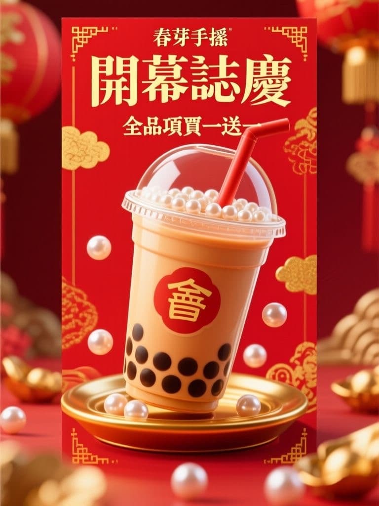
Bubble Tea Grand Opening Poster (Festive Red & Gold Pop)
Red-and-gold festivity reads as 'grand opening' at a glance, and the 3D drink hero stops foot traffic; the clean lower third lets you drop in your address and QR code without re-editing the artwork.
 Posters
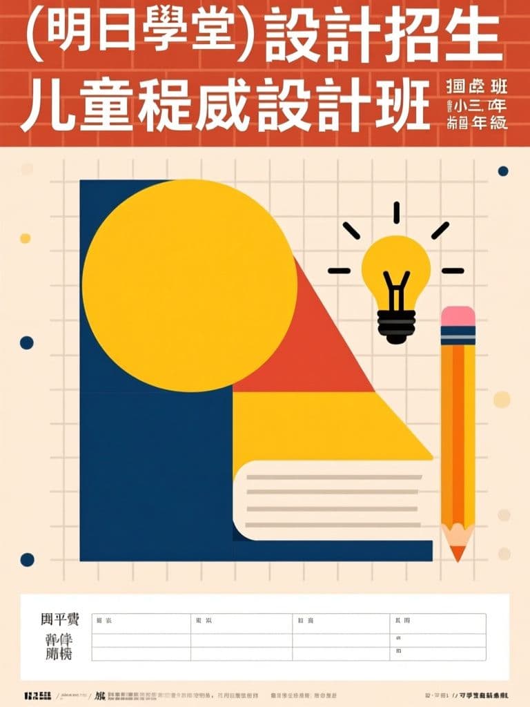
Tutoring Center Enrollment Poster (Bauhaus Geometric Style)
Bauhaus geometry stands out on a wall of generic tutoring flyers while still reading trustworthy to parents; the layout pre-reserves the bottom band for schedule and tuition — the first things parents look for.
 Posters
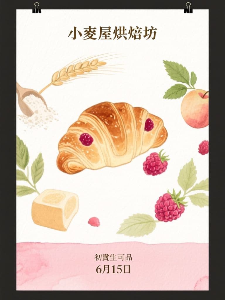
Bakery Seasonal Launch Poster (Soft Watercolor)
Watercolor illustration signals hand-made craft better than a product photo, and the orbiting-ingredients composition pulls the eye straight to the new item — artisan look without hiring an illustrator.
 Posters
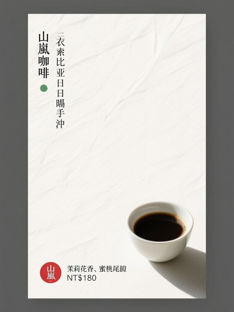
Cafe New Brew Poster (Japanese Minimalism)
Seventy percent negative space is what makes it stand out — minimalism reads as premium for specialty coffee, and the red hanko price stamp gives the eye one precise anchor point.
 Posters
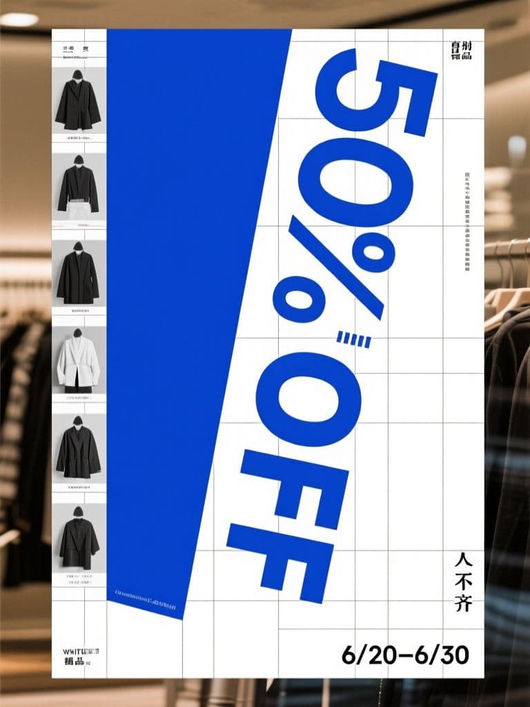
Boutique End-of-Season Sale Poster (Swiss Grid)
Turning the discount numeral itself into the rotated hero graphic is the classic Swiss conversion trick — the rational grid makes a markdown look like a designer drop, not a clearance bin.
 Posters
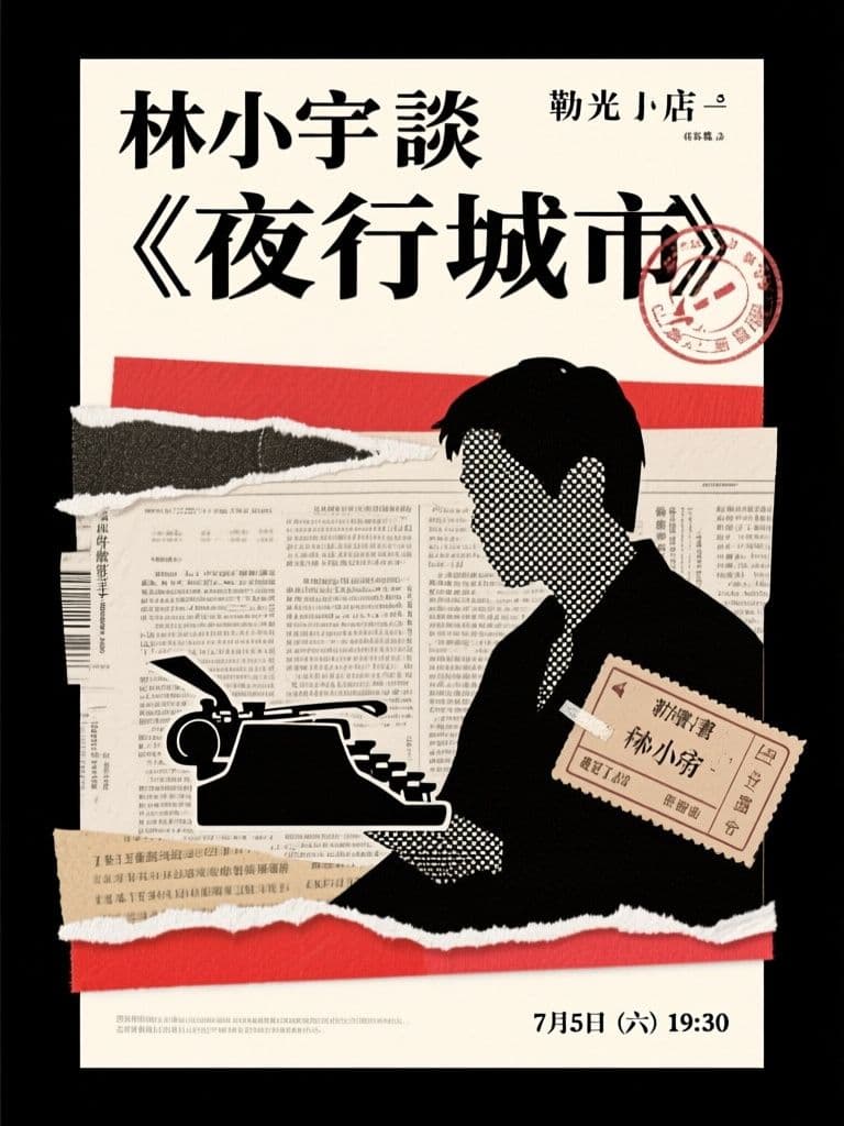
Bookstore Author Talk Poster (Paper Collage)
Collage roughness matches exactly what a literary audience finds authentic, and the ransom-note headline is inherently shareable — far more repostable than a templated event flyer.