
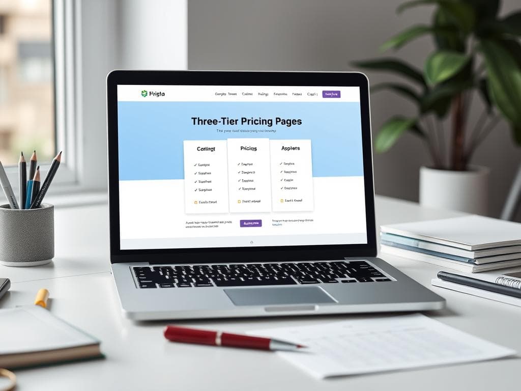
Three-Tier Pricing Page (Anchor & Decoy Psychology)
Borrowing decoy pricing and anchoring straight from behavioural economics, this prompt makes your middle plan the no-brainer pick — and the built-in objection-killing FAQ saves you an entire revision round.
prompt
Create pricing page copy for {business_name}, a {service_type} serving {customer_segment}. Build three tiers — a lean entry plan, a 'Most Popular' middle plan priced at {core_price}, and a premium anchor plan — using decoy pricing so the middle tier feels like the obvious choice. For each tier write a persona-based plan name, a one-line who-it's-for subtitle, 5-7 benefit-phrased feature bullets describing outcomes rather than specs, and a distinct CTA verb. Then add a 4-question FAQ that pre-handles refund, upgrade, billing-cycle and team-size objections, plus one trust line under the buttons. Keep the entire page under 450 words, scannable, and free of jargon.
Variables
This prompt uses the variables below. Fill them in when you hit Copy — anything left blank keeps its {placeholder}.
- {business_name}Name of the business or product
- e.g. Pixel Forge Studio
- {service_type}Type of service or product offered
- e.g. subscription web design service
- {customer_segment}Primary customer segment
- e.g. small e-commerce brands
- {core_price}Price of the flagship middle tier
- e.g. US$299/month
Use case
A SaaS founder or service studio owner designing their pricing page and unsure how to structure three plans that actually convert.
How to use it
Fill in four variables: {business_name} is your brand, {service_type} is what you sell (e.g. 'subscription web design service'), {customer_segment} is your core audience, and {core_price} is the price of the featured middle plan (the example uses US$299/mo — swap in NT$ or HK$ freely). Run it through claude or chatgpt — they handle the layered logic of decoy pricing best; gemini works too, but it sometimes weights the three tiers too evenly, so check the middle one still stands out. After generating, verify one thing above all: the premium tier's price must sit clearly above {core_price} (aim for 2-3x) so the middle plan reads as the sensible buy. Once the copy is locked, drop it into Canva to lay it out as real pricing cards before publishing.
Why it works
The clever part is that the prompt does not just ask for three plans — it assigns each tier a role: the lean entry plan scouts, the 'Most Popular' middle plan does the selling, and the premium plan exists purely as a price anchor. Seeing the high premium price makes the middle tier feel like the rational choice — that is decoy pricing at work. Demanding benefit-phrased bullets instead of specs, plus a distinct CTA verb per tier, forces the copy to speak from the customer's 'what do I get' angle rather than listing features. The prompt also bakes in a 4-question FAQ that pre-empts the four most common stalls — refund, upgrade, billing cycle and team size — while the 450-word ceiling keeps the whole page scannable in one glance, denying a hesitant reader time to talk themselves out of buying.
Tips & variations
- To push annual billing, append a line asking it to show {core_price} for the middle plan alongside an annual figure with two months free, so the savings feel concrete.
- It is normal for the premium tier to attract few buyers — its job is to be the anchor; if you genuinely want to sell it, append 'add a 1-on-1 custom consult to the premium plan' to widen its value gap over the middle tier.
- The FAQ already includes a 'team size' question, which suits B2B; if your audience skews enterprise procurement, append a request to swap the 'refund' question for 'invoicing and expense-claim process', which maps to how companies actually buy.
- To A/B test the badge, ask it to generate three alternative labels for the middle plan's 'Most Popular' tag (e.g. 'What most people pick', 'Best value') and rotate them live to measure clicks.
Recommended tools
Contains affiliate links: we may earn a commission when you purchase or sign up through them, at no extra cost to you.
Related prompts
 Landing Pages
Online Course Sales Page (Story-Driven Long Copy)
Long-form course pages live or die on narrative momentum. This prompt locks in the proven 9-beat structure from pain hook to urgency close, so you get a page that reads like a story and sells like a funnel in one pass.
 Landing Pages
Grand Opening Waitlist Page (LINE Sign-Up Funnel)
One screen, one field, one job: this prompt strips the waitlist page down to a single above-the-fold conversion moment, with opening-day perks that turn passers-by into day-one regulars.
 Landing Pages
Fitness Trial Landing Page (Full-Page Block Blueprint)
Instead of loose paragraphs you get eight labelled blocks with copy and layout notes baked in — hand it straight to your designer or page builder and skip the back-and-forth entirely.
 Landing Pages
Restaurant Tasting Menu Reservation Page (Editorial Minimal)
Pairs a chef's-note sourcing story with per-night seat scarcity; teasing just three courses converts better than dumping the full menu.
 Landing Pages
Bubble Tea Loyalty App Download Page (Playful Gen-Z)
Leads with the sign-up reward and compresses the whole pitch into one mobile screen — three benefit cards do all the persuading.
 Landing Pages
Bakery Holiday Gift Box Pre-Order Page (Warm Handcrafted)
Sells the unboxing moment instead of a spec list, adds a deadline banner for urgency, and ships a five-question FAQ that deflects most support DMs.