
Agency Case Study Carousel Cover (Editorial Collage)
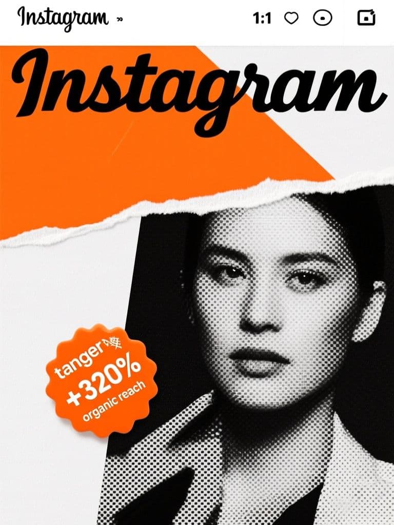
Torn-paper collage plus an oversized result badge stops the scroll, while the diagonal composition pulls viewers to swipe — the top safe margin keeps your hook copy uncropped on every placement.
prompt
Design a 1:1 Instagram carousel cover ad for a creative agency case study. Use a bold editorial collage style: layered torn-paper textures, an oversized serif headline block, a halftone photo cutout showing {project_type} work, and a vivid {accent_color} sticker badge displaying the result {result_stat}. Split the composition diagonally so the photo cutout fills the lower right and graphic shapes fill the upper left. Reserve the top 20 percent of the frame as a clean safe margin for ad copy and the agency positioning line about {agency_niche}. Slightly rough print texture, confident art-directed look, flat lighting, no real client logos.
Variables
This prompt uses the variables below. Fill them in when you hit Copy — anything left blank keeps its {placeholder}.
- {project_type}Type of project work shown in the photo cutout
- e.g. brand identity redesign
- {accent_color}Accent color used for the sticker badge
- e.g. tangerine orange
- {result_stat}Result statistic displayed on the badge
- e.g. +320% organic reach
- {agency_niche}The agency's niche or positioning statement
- e.g. B2B SaaS branding
Use case
Creative agencies and freelancers promoting case-study carousels on Instagram to win new clients.
Recommended tools
Contains affiliate links: we may earn a commission when you purchase or sign up through them, at no extra cost to you.
Related prompts
 Ad Images
Fitness Before/After Ad (Split-Screen Light Contrast)
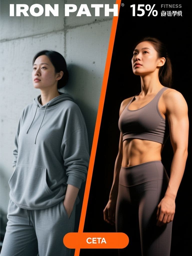
The cold-versus-warm lighting contrast tells the transformation story before anyone reads a word, and the reserved top and bottom strips mean your headline and CTA drop in cleanly without fighting the photo.
 Ad Images
Bubble Tea Grand Opening Hero (Red-Gold Festive)
Red-and-gold opening visuals are conversion shorthand across Taiwan and Hong Kong — this prompt nails the festive cues while keeping the layout clean enough for your offer text, skipping a round-trip to a designer.
 Ad Images
UGC Skincare Lifestyle Ad (Phone-Shot Authentic)
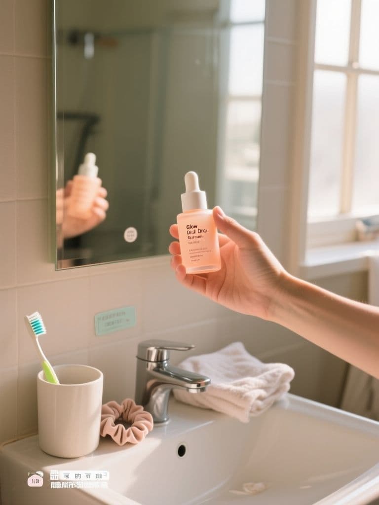
Polished studio ads get scrolled past — this prompt engineers the real-customer-photo cues (grain, mess, window light) that make feed audiences stop, while the quiet lower third leaves room for price stickers and captions.
 Ad Images
App Install Banner (3D Gradient Phone Mockup)
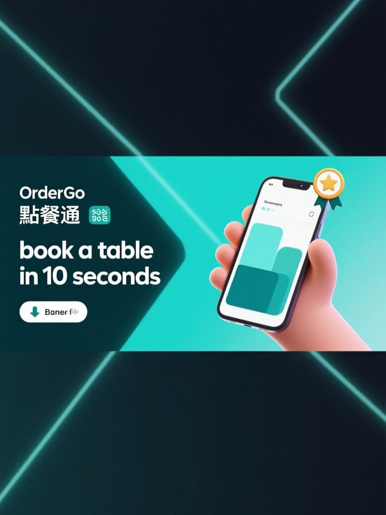
The tilted phone mockup plus left-side negative space is the classic install-ad layout that survives every text overlay — you get an on-spec 1.91:1 banner without ever opening a design tool.
 Ad Images
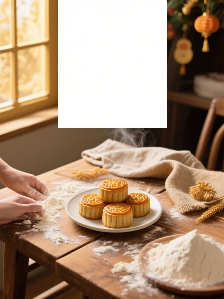
Bakery Holiday Sale Hero (Rustic Flat-Lay)
The quiet top-third safe margin plus appetite-driven flat-lay composition lets you drop seasonal copy straight onto the image — one generation replaces a photographer, stylist, and designer for every holiday push.
 Ad Images
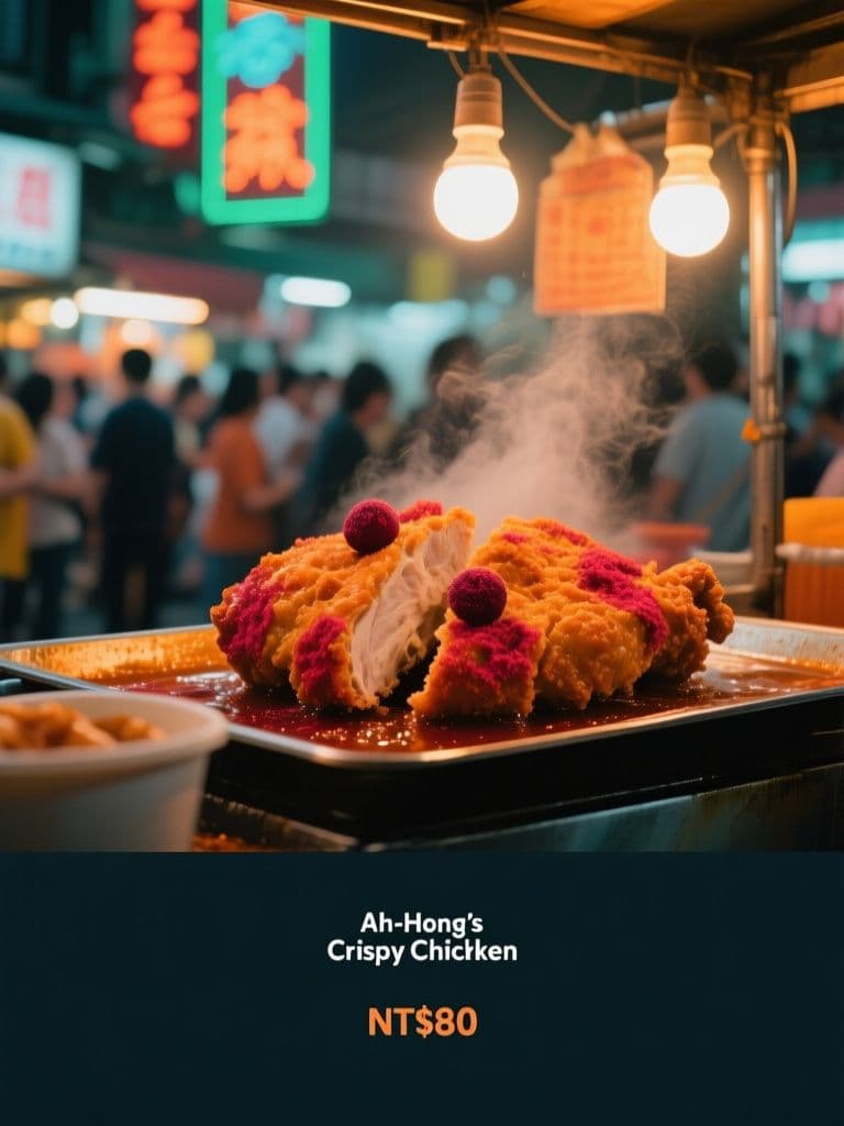
Night Market Stall Ad (Neon Street Cinematic)
Teal-and-orange neon grading plus crowd bokeh signals 'authentic street food worth queuing for', while the built-in dark gradient band keeps your price copy legible at feed-scroll speed.